Customizing your dashboard
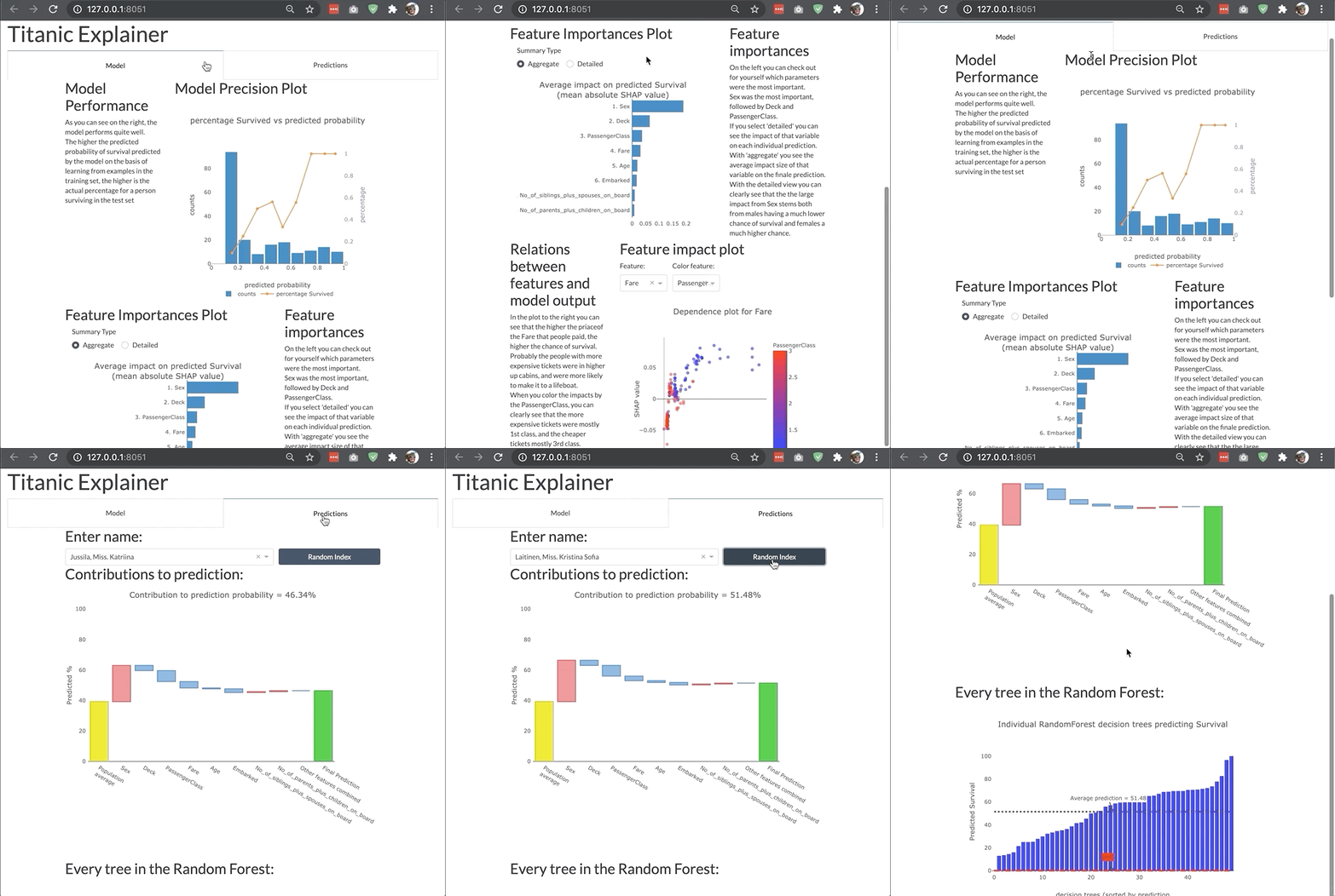
The dashboard is highly modular and customizable so that you can adjust it your own needs and project. You can switch off tabs, control the features of invidual components in the dashboard, or even build your entire custom dashboard layout like the example below:

Changing bootstrap theme
You can change the bootstrap theme by passing a link to the appropriate css file. You can use the convenient themes module of dash_bootstrap_components to generate the css url for you:
import dash_bootstrap_components as dbc

ExplainerDashboard(explainer, bootstrap=dbc.themes.FLATLY).run()
See the dbc themes documentation for the different themes that are supported.
Switching off tabs
You can switch off individual tabs using boolean flags, e.g.:
ExplainerDashboard(explainer,
    importances=False,
    model_summary=True,
    contributions=True,
    whatif=True,
    shap_dependence=True,
    shap_interaction=False,
    decision_trees=True)
Hiding components
You can also hide individual components on the various tabs:
ExplainerDashboard(explainer,
    # importances tab:
    hide_importances=True,
    # classification stats tab:
    hide_globalcutoff=True, hide_modelsummary=True,
    hide_confusionmatrix=True, hide_precision=True,
    hide_classification=True, hide_rocauc=True,
    hide_prauc=True, hide_liftcurve=True, hide_cumprecision=True,
    # regression stats tab:
    # hide_modelsummary=True,
    hide_predsvsactual=True, hide_residuals=True,
    hide_regvscol=True,
    # individual predictions tab:
    hide_predindexselector=True, hide_predictionsummary=True,
    hide_contributiongraph=True, hide_pdp=True,
    hide_contributiontable=True,
    # whatif tab:
    hide_whatifindexselector=True, hide_inputeditor=True,
    hide_whatifcontribution=True, hide_whatifpdp=True,
    # shap dependence tab:
    hide_shapsummary=True, hide_shapdependence=True,
    # shap interactions tab:
    hide_interactionsummary=True, hide_interactiondependence=True,
    # decisiontrees tab:
    hide_treeindexselector=True, hide_treesgraph=True,
    hide_treepathtable=True, hide_treepathgraph=True,
    ).run()
Hiding toggles and dropdowns inside components
You can also hide individual toggles and dropdowns using **kwargs. However they are not individually targeted, so if you pass hide_cats=True then the group cats toggle will be hidden on every component that has one:
ExplainerDashboard(explainer,
    no_permutations=True, # do not show or calculate permutation importances
    hide_popout=True, # hide the 'popout' button for each graph
    hide_poweredby=True, # hide the 'powerered by: explainerdashboard' footer
    hide_popout=True, # hide the 'popout' button from each graph
    hide_depth=True, # hide the depth (no of features) dropdown
    hide_sort=True, # hide sort type dropdown in contributions graph/table
    hide_orientation=True, # hide orientation dropdown in contributions graph/table
    hide_type=True, # hide shap/permutation toggle on ImportancesComponent
    hide_dropna=True, # hide dropna toggle on pdp component
    hide_sample=True, # hide sample size input on pdp component
    hide_gridlines=True, # hide gridlines on pdp component
    hide_gridpoints=True, # hide gridpoints input on pdp component
    hide_cutoff=True, # hide cutoff selector on classification components
    hide_percentage=True, # hide percentage toggle on classificaiton components
    hide_log_x=True, # hide x-axis logs toggle on regression plots
    hide_log_y=True, # hide y-axis logs toggle on regression plots
    hide_ratio=True, # hide the residuals type dropdown
    hide_points=True, # hide the show violin scatter markers toggle
    hide_winsor=True, # hide the winsorize input
    hide_wizard=True, # hide the wizard from the lift curve
)
Setting default values
You can also set default values for the various dropdowns and toggles. All the components with their parameters can be found in the componentsdocumentation. Some examples of useful parameters to pass:
ExplainerDashboard(explainer,
    index='Rugg, Miss. Emily', # initial index to display
    col='Fare', # initial feature in shap graphs
    color_col='Age', # color feature in shap dependence graph
    interact_col='Age', # interaction feature in shap interaction
    higher_is_better=False, # flip green and red in contributions graph
    depth=5, # only show top 5 features
    sort = 'low-to-high', # sort features from lowest shap to highest in contributions graph/table
    orientation='horizontal', # horizontal bars in contributions graph
    cats_topx = 3, # show only the top 3 categories
    cats_sort = 'shap', # sort categories by mean abs shap instead of 'freq' or 'alphabet'
    pdp_col='Fare', # initial pdp feature
    cutoff=0.8, # cutoff for classification plots
    round=2 # round floats to 2 digits
    show_metrics=['accuracy', 'f1', custom_metric] # only show certain metrics
    plot_sample=1000, # only display a 1000 random markers in scatter plots
    )
Using custom metrics
By default the dashboard shows a number of metrics for classifiers (accuracy, etc)
and regression models (R-squared, etc). You can control which metrics are shown
and in what order by passing show_metrics:
ExplainerDashboard(explainer, show_metrics=['accuracy', 'f1', 'recall']).run()
However you can also define custom metrics functions yourself as long as they
take y_true and y_pred as parameters:
def custom_metric(y_true, y_pred):
    return np.mean(y_true)-np.mean(y_pred)

ExplainerDashboard(explainer, show_metrics=['accuracy', custom_metric]).run()
For ClassifierExplainer, y_true and y_pred will have already been
calculated as an array of 1 and 0 depending on the pos_label and
cutoff that was passed to explainer.metrics(). However, if you take
pos_label and cutoff as parameters to the custom metric function, then you will get the
unprocessed raw labels and pred_probas. So for example you could calculate
a sum of cost function over the confusion matrix as a custom metric. Then the following
metrics would all work and have the equivalent result:
from sklearn.metrics import confusion_matrix

def cost_metric(y_true, y_pred):
    cost_matrix = np.array([[10, -50], [-20, 10]])
    cm = confusion_matrix(y_true, y_pred)
    return (cost_matrix * cm).sum()

def cost_metric2(y_true, y_pred, cutoff):
    return cost_metric(y_true, np.where(y_pred>cutoff, 1, 0))

def cost_metric3(y_true, y_pred, pos_label):
    return cost_metric(np.where(y_true==pos_label, 1, 0), y_pred[:, pos_label])

def cost_metric4(y_true, y_pred, cutoff, pos_label):
    return cost_metric(np.where(y_true==pos_label, 1, 0),
                        np.where(y_pred[:, pos_label] > cutoff, 1, 0))

explainer.metrics(show_metrics=[cost_metric, cost_metric2, cost_metric3, cost_metric4]).run()
Note
When storing an ExplainerDashboard.to_yaml() the custom metric functions will
be stored to the .yaml file with a reference to their name and module.
So when loading the dashboard from_config() you have to make sure the
metric function can be found by the same name in the same module (which
could be __main__), otherwise the dashboard will fail to load.