ExplainerComponents
The dashboard is constructed out of ExplainerComponents: self-contained reusable
elements usually consisting of a plot or table and various dropdowns, sliders
and toggles to manipulate that plot. Components can be connected with connectors,
so that when you select an index in one component that automatically updates the
index in another component for example.
When you run ExplainerDashboard you get the default dashboard with basically
every component listed below with every toggle and slider visible.
The ExplainerComponents make it very easy to construct your own dashboard
with your own layout, with specific explanations for the workings and results
of your model. So you can select which components to use, where to put them
in the layout, which toggles and sliders to display, and what the initial values
for component should be. This way you can also control which interactive
aspects your end users can and cannot control.
You import the components with from explainerdashboard.custom import *
A simple example, where you build a page with only a ShapDependenceComponent,
but with no group cats or highlight toggle, and initial feature set to ‘Fare’:
from explainerdashboard.custom import *

class CustomDashboard(ExplainerComponent):
   def __init__(self, explainer, title="Custom Dashboard", name="None"):
      super().__init__(explainer, title, name=name)
      self.shap_dependence = ShapDependenceComponent(explainer, name=self.name+"dep",
                         hide_title=True, hide_cats=True, hide_highlight=True,
                         cats=True, col='Fare')

   def layout(self):
      return html.Div([
         self.shap_dependence.layout()
     ])

 ExplainerDashboard(explainer, CustomDashboard).run()
ExplainerComponent
Each component subclasses ExplainerComponent which provides the basic
functionality of registering subcomponents, dependencies, registering callbacks
of subcomponents, calculating dependencies, and providing a list of pos label
selectors of all subcomponents.
ExplainerComponent
- class explainerdashboard.dashboard_methods.ExplainerComponent(explainer, title=None, name=None)
ExplainerComponent is a bundle of a dash layout and callbacks that make use of an Explainer object.
An ExplainerComponent can have ExplainerComponent subcomponents, that you register with register_components(). If the component depends on certain lazily calculated Explainer properties, you can register these with register_dependencies().
ExplainerComponent makes sure that:
Callbacks of subcomponents are registered.
Lazily calculated dependencies (even of subcomponents) can be calculated.
Pos labels selector id’s of all subcomponents can be calculated.
Each ExplainerComponent adds a unique uuid name string to all elements, so that there is never a name clash even with multiple ExplanerComponents of the same type in a layout.
Important
define your callbacks in component_callbacks() and ExplainerComponent will register callbacks of subcomponents in addition to component_callbacks() when calling register_callbacks()
initialize the ExplainerComponent
- Parameters
explainer (Explainer) – explainer object constructed with e.g. ClassifierExplainer() or RegressionExplainer()
title (str, optional) – Title of tab or page. Defaults to None.
name (str, optional) – unique name to add to Component elements. If None then random uuid is generated to make sure it’s unique. Defaults to None.
- exclude_callbacks(*components)
exclude certain subcomponents from the register_components scan
- register_components(*components)
register subcomponents so that their callbacks will be registered and dependencies can be tracked
- Parameters
scan_self (bool, optional) – scan self.__dict__ and add all
True (ExplainerComponent attributes to _components. Defaults to) –
- register_dependencies(*dependencies)
register dependencies: lazily calculated explainer properties that you want to calculate before starting the dashboard
- property dependencies
returns a list of unique dependencies of the component and all subcomponents
- property component_imports
returns a list of ComponentImport namedtuples(“component”, “module”) all components and and subcomponents
- get_state_tuples()
returns a list of State (id, property) tuples for the component and all subcomponents
- get_state_args(state_dict=None)
returns _state_dict with correct self.name attached if state_dict is passed then replace the state_id_prop_tuples with their values from state_dict or else as a property.
- property pos_labels
returns a list of unique pos label selector elements of the component and all subcomponents
- calculate_dependencies()
calls all properties in self.dependencies so that they get calculated up front. This is useful to do before starting a dashboard, so you don’t compute properties multiple times in parallel.
- layout()
layout to be defined by the particular ExplainerComponent instance. All element id’s should append +self.name to make sure they are unique.
- to_html(state_dict=None, add_header=True)
return static html for this component and all subcomponents.
- Parameters
state_dict (dict) – dictionary with id_prop_tuple as keys and state as value.
- save_html(filename)
Store output of to_html to a file
- Parameters
filename (str, Path) – filename to store html
- component_callbacks(app)
register callbacks specific to this ExplainerComponent.
- register_callbacks(app)
First register callbacks of all subcomponents, then call component_callbacks(app)
shap_components
ShapSummaryComponent
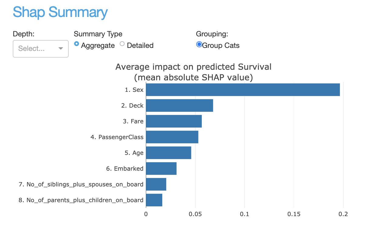
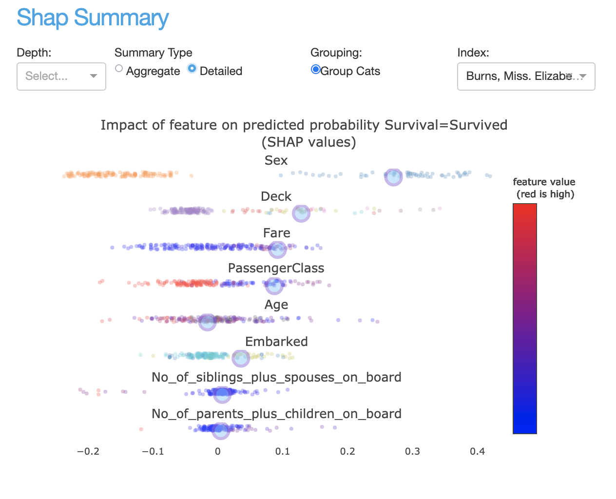
- class explainerdashboard.dashboard_components.shap_components.ShapSummaryComponent(explainer, title='Shap Summary', name=None, subtitle='Ordering features by shap value', hide_title=False, hide_subtitle=False, hide_depth=False, hide_type=False, hide_index=False, hide_selector=False, hide_popout=False, pos_label=None, depth=None, summary_type='aggregate', max_cat_colors=5, index=None, plot_sample=None, description=None, **kwargs)
Shows shap summary component
- Parameters
explainer (Explainer) – explainer object constructed with either ClassifierExplainer() or RegressionExplainer()
title (str, optional) – Title of tab or page. Defaults to “Shap Dependence Summary”.
name (str, optional) – unique name to add to Component elements. If None then random uuid is generated to make sure it’s unique. Defaults to None.
subtitle (str) – subtitle
hide_title (bool, optional) – hide the title. Defaults to False.
hide_subtitle (bool, optional) – Hide subtitle. Defaults to False.
hide_depth (bool, optional) – hide the depth toggle. Defaults to False.
hide_type (bool, optional) – hide the summary type toggle (aggregated, detailed). Defaults to False.
hide_popout (bool, optional) – hide popout button
hide_selector (bool, optional) – hide pos label selector. Defaults to False.
pos_label ({int, str}, optional) – initial pos label. Defaults to explainer.pos_label
depth (int, optional) – initial number of features to show. Defaults to None.
summary_type (str, {'aggregate', 'detailed'}. optional) – type of summary graph to show. Defaults to “aggregate”.
max_cat_colors (int, optional) – for categorical features, maximum number of categories to label with own color. Defaults to 5.
plot_sample (int, optional) – Instead of all points only plot a random sample of points. Defaults to None (=all points)
description (str, optional) – Tooltip to display when hover over component title. When None default text is shown.
- layout()
layout to be defined by the particular ExplainerComponent instance. All element id’s should append +self.name to make sure they are unique.
- to_html(state_dict=None, add_header=True)
return static html for this component and all subcomponents.
- Parameters
state_dict (dict) – dictionary with id_prop_tuple as keys and state as value.
- component_callbacks(app)
register callbacks specific to this ExplainerComponent.
ShapDependenceComponent
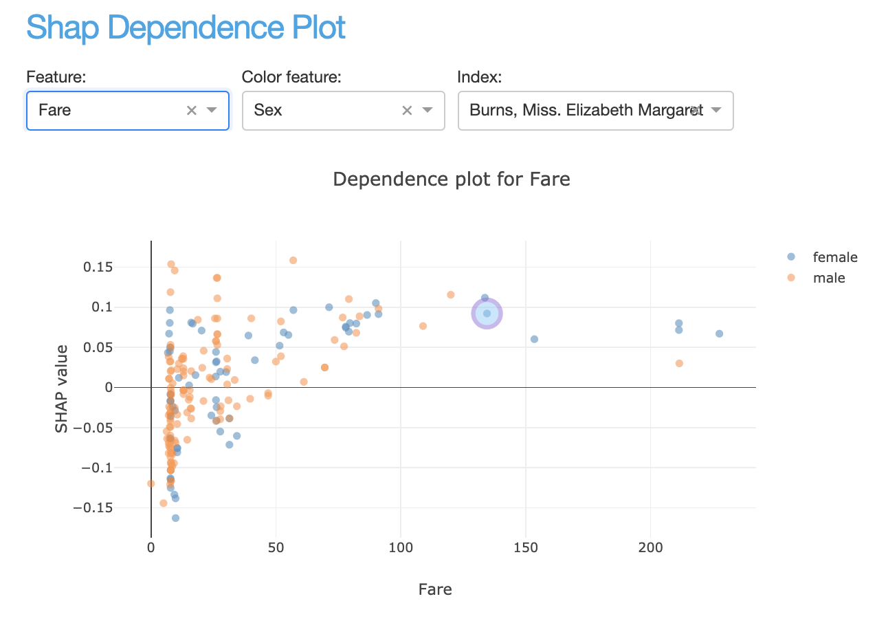
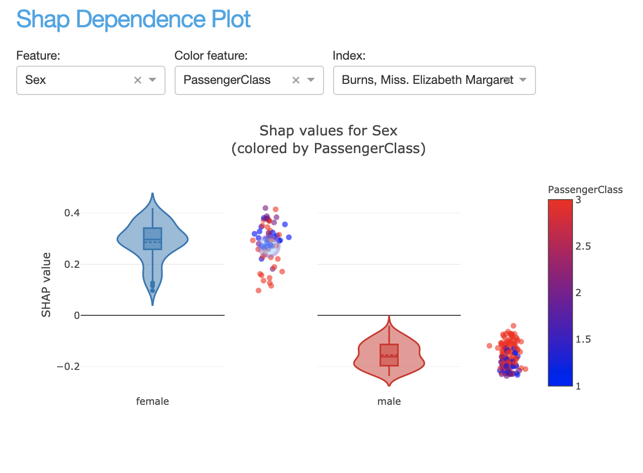
- class explainerdashboard.dashboard_components.shap_components.ShapDependenceComponent(explainer, title='Shap Dependence', name=None, subtitle='Relationship between feature value and SHAP value', hide_title=False, hide_subtitle=False, hide_col=False, hide_color_col=False, hide_index=False, hide_selector=False, hide_outliers=False, hide_cats_topx=False, hide_cats_sort=False, hide_popout=False, hide_footer=False, pos_label=None, col=None, color_col=None, index=None, remove_outliers=False, cats_topx=10, cats_sort='freq', max_cat_colors=5, plot_sample=None, description=None, **kwargs)
Show shap dependence graph
- Parameters
explainer (Explainer) – explainer object constructed with either ClassifierExplainer() or RegressionExplainer()
title (str, optional) – Title of tab or page. Defaults to “Shap Dependence”.
name (str, optional) – unique name to add to Component elements. If None then random uuid is generated to make sure it’s unique. Defaults to None.
subtitle (str) – subtitle
hide_title (bool, optional) – hide component title. Defaults to False.
hide_subtitle (bool, optional) – Hide subtitle. Defaults to False.
hide_col (bool, optional) – hide feature selector. Defaults to False.
hide_color_col (bool, optional) – hide color feature selector Defaults to False.
hide_index (bool, optional) – hide index selector Defaults to False.
hide_selector (bool, optional) – hide pos label selector. Defaults to False.
hide_cats_topx (bool, optional) – hide the categories topx input. Defaults to False.
hide_cats_sort (bool, optional) – hide the categories sort selector.Defaults to False.
hide_outliers (bool, optional) – Hide remove outliers toggle input. Defaults to False.
hide_popout (bool, optional) – hide popout button. Defaults to False.
hide_footer (bool, optional) – hide the footer.
pos_label ({int, str}, optional) – initial pos label. Defaults to explainer.pos_label
col (str, optional) – Feature to display. Defaults to None.
color_col (str, optional) – Color plot by values of this Feature. Defaults to None.
index (int, optional) – Highlight a particular index. Defaults to None.
remove_outliers (bool, optional) – remove outliers in feature and color feature from the plot.
cats_topx (int, optional) – maximum number of categories to display for categorical features. Defaults to 10.
cats_sort (str, optional) – how to sort categories: ‘alphabet’, ‘freq’ or ‘shap’. Defaults to ‘freq’.
max_cat_colors (int, optional) – for categorical features, maximum number of categories to label with own color. Defaults to 5.
plot_sample (int, optional) – Instead of all points only plot a random sample of points. Defaults to None (=all points)
description (str, optional) – Tooltip to display when hover over component title. When None default text is shown.
- layout()
layout to be defined by the particular ExplainerComponent instance. All element id’s should append +self.name to make sure they are unique.
- to_html(state_dict=None, add_header=True)
return static html for this component and all subcomponents.
- Parameters
state_dict (dict) – dictionary with id_prop_tuple as keys and state as value.
- component_callbacks(app)
register callbacks specific to this ExplainerComponent.
ShapSummaryDependenceConnector
- class explainerdashboard.dashboard_components.shap_components.ShapSummaryDependenceConnector(shap_summary_component, shap_dependence_component)
Connects a ShapSummaryComponent with a ShapDependence Component:
When clicking on feature in ShapSummary, then select that feature in ShapDependence
- Parameters
shap_summary_component (ShapSummaryComponent) – ShapSummaryComponent
shap_dependence_component (ShapDependenceComponent) – ShapDependenceComponent
- component_callbacks(app)
register callbacks specific to this ExplainerComponent.
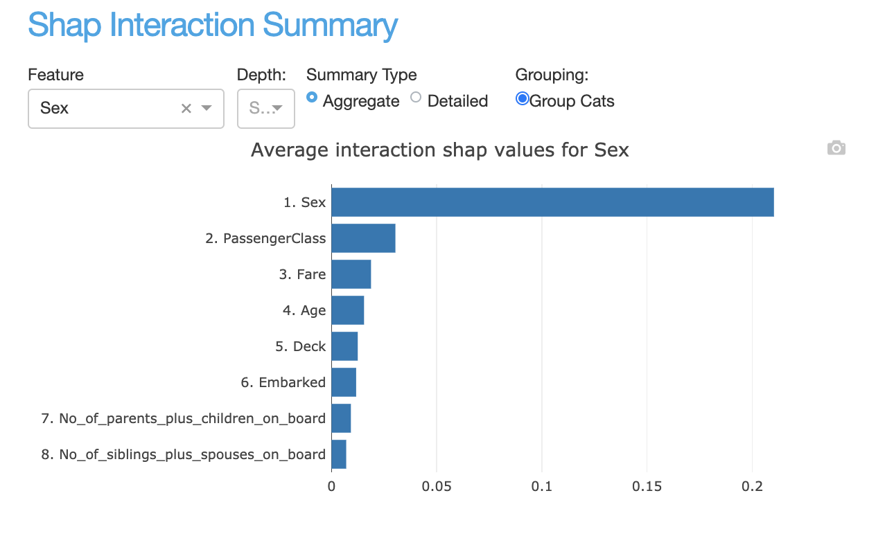
InteractionSummaryComponent
- class explainerdashboard.dashboard_components.shap_components.InteractionSummaryComponent(explainer, title='Interactions Summary', name=None, subtitle='Ordering features by shap interaction value', hide_title=False, hide_subtitle=False, hide_col=False, hide_depth=False, hide_type=False, hide_index=False, hide_popout=False, hide_selector=False, pos_label=None, col=None, depth=None, summary_type='aggregate', max_cat_colors=5, index=None, plot_sample=None, description=None, **kwargs)
Show SHAP Interaciton values summary component
- Parameters
explainer (Explainer) – explainer object constructed with either ClassifierExplainer() or RegressionExplainer()
title (str, optional) – Title of tab or page. Defaults to “Interactions Summary”.
name (str, optional) – unique name to add to Component elements. If None then random uuid is generated to make sure it’s unique. Defaults to None.
subtitle (str) – subtitle
hide_title (bool, optional) – hide the component title. Defaults to False.
hide_subtitle (bool, optional) – Hide subtitle. Defaults to False.
hide_col (bool, optional) – Hide the feature selector. Defaults to False.
hide_depth (bool, optional) – Hide depth toggle. Defaults to False.
hide_type (bool, optional) – Hide summary type toggle. Defaults to False.
hide_index (bool, optional) – Hide the index selector. Defaults to False
hide_popout (bool, optional) – hide popout button
hide_selector (bool, optional) – hide pos label selector. Defaults to False.
pos_label ({int, str}, optional) – initial pos label. Defaults to explainer.pos_label
col (str, optional) – Feature to show interaction summary for. Defaults to None.
depth (int, optional) – Number of interaction features to display. Defaults to None.
summary_type (str, {'aggregate', 'detailed'}, optional) – type of summary graph to display. Defaults to “aggregate”.
max_cat_colors (int, optional) – for categorical features, maximum number of categories to label with own color. Defaults to 5.
index (str) – Default index. Defaults to None.
plot_sample (int, optional) – Instead of all points only plot a random sample of points. Defaults to None (=all points)
description (str, optional) – Tooltip to display when hover over component title. When None default text is shown.
- layout()
layout to be defined by the particular ExplainerComponent instance. All element id’s should append +self.name to make sure they are unique.
- to_html(state_dict=None, add_header=True)
return static html for this component and all subcomponents.
- Parameters
state_dict (dict) – dictionary with id_prop_tuple as keys and state as value.
- component_callbacks(app)
register callbacks specific to this ExplainerComponent.
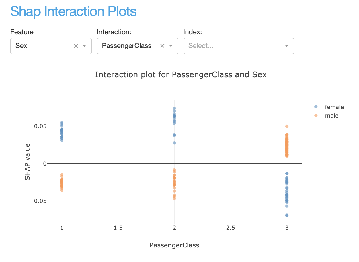
InteractionDependenceComponent
- class explainerdashboard.dashboard_components.shap_components.InteractionDependenceComponent(explainer, title='Interaction Dependence', name=None, subtitle='Relation between feature value and shap interaction value', hide_title=False, hide_subtitle=False, hide_col=False, hide_interact_col=False, hide_index=False, hide_popout=False, hide_selector=False, hide_outliers=False, hide_cats_topx=False, hide_cats_sort=False, hide_top=False, hide_bottom=False, pos_label=None, col=None, interact_col=None, remove_outliers=False, cats_topx=10, cats_sort='freq', max_cat_colors=5, plot_sample=None, description=None, index=None, **kwargs)
Interaction Dependence Component.
- Shows two graphs:
top graph: col vs interact_col bottom graph: interact_col vs col
- Parameters
explainer (Explainer) – explainer object constructed with either ClassifierExplainer() or RegressionExplainer()
title (str, optional) – Title of tab or page. Defaults to “Interactions Dependence”.
name (str, optional) – unique name to add to Component elements. If None then random uuid is generated to make sure it’s unique. Defaults to None.
subtitle (str) – subtitle
hide_title (bool, optional) – Hide component title. Defaults to False.
hide_subtitle (bool, optional) – Hide subtitle. Defaults to False.
hide_col (bool, optional) – Hide feature selector. Defaults to False.
hide_interact_col (bool, optional) – Hide interaction feature selector. Defaults to False.
hide_highlight (bool, optional) – Hide highlight index selector. Defaults to False.
hide_selector (bool, optional) – hide pos label selector. Defaults to False.
hide_outliers (bool, optional) – Hide remove outliers toggle input. Defaults to False.
hide_popout (bool, optional) – hide popout button
hide_cats_topx (bool, optional) – hide the categories topx input. Defaults to False.
hide_cats_sort (bool, optional) – hide the categories sort selector. Defaults to False.
hide_top (bool, optional) – Hide the top interaction graph (col vs interact_col). Defaults to False.
hide_bottom (bool, optional) – hide the bottom interaction graph (interact_col vs col). Defaults to False.
pos_label ({int, str}, optional) – initial pos label. Defaults to explainer.pos_label
col (str, optional) – Feature to find interactions for. Defaults to None.
interact_col (str, optional) – Feature to interact with. Defaults to None.
highlight (int, optional) – Index row to highlight Defaults to None.
remove_outliers (bool, optional) – remove outliers in feature and color feature from the plot.
cats_topx (int, optional) – number of categories to display for categorical features.
cats_sort (str, optional) – how to sort categories: ‘alphabet’, ‘freq’ or ‘shap’. Defaults to ‘freq’.
max_cat_colors (int, optional) – for categorical features, maximum number of categories to label with own color. Defaults to 5.
plot_sample (int, optional) – Instead of all points only plot a random sample of points. Defaults to None (=all points)
description (str, optional) – Tooltip to display when hover over component title. When None default text is shown.
- layout()
layout to be defined by the particular ExplainerComponent instance. All element id’s should append +self.name to make sure they are unique.
- to_html(state_dict=None, add_header=True)
return static html for this component and all subcomponents.
- Parameters
state_dict (dict) – dictionary with id_prop_tuple as keys and state as value.
- component_callbacks(app)
register callbacks specific to this ExplainerComponent.
InteractionSummaryDependenceConnector
- class explainerdashboard.dashboard_components.shap_components.InteractionSummaryDependenceConnector(interaction_summary_component, interaction_dependence_component)
Connects a InteractionSummaryComponent with an InteractionDependenceComponent:
When select feature in summary, then select col in Dependence
- When clicking on interaction feature in Summary, then select that interaction
feature in Dependence.
- Parameters
shap_summary_component (ShapSummaryComponent) – ShapSummaryComponent
shap_dependence_component (ShapDependenceComponent) – ShapDependenceComponent
- component_callbacks(app)
register callbacks specific to this ExplainerComponent.
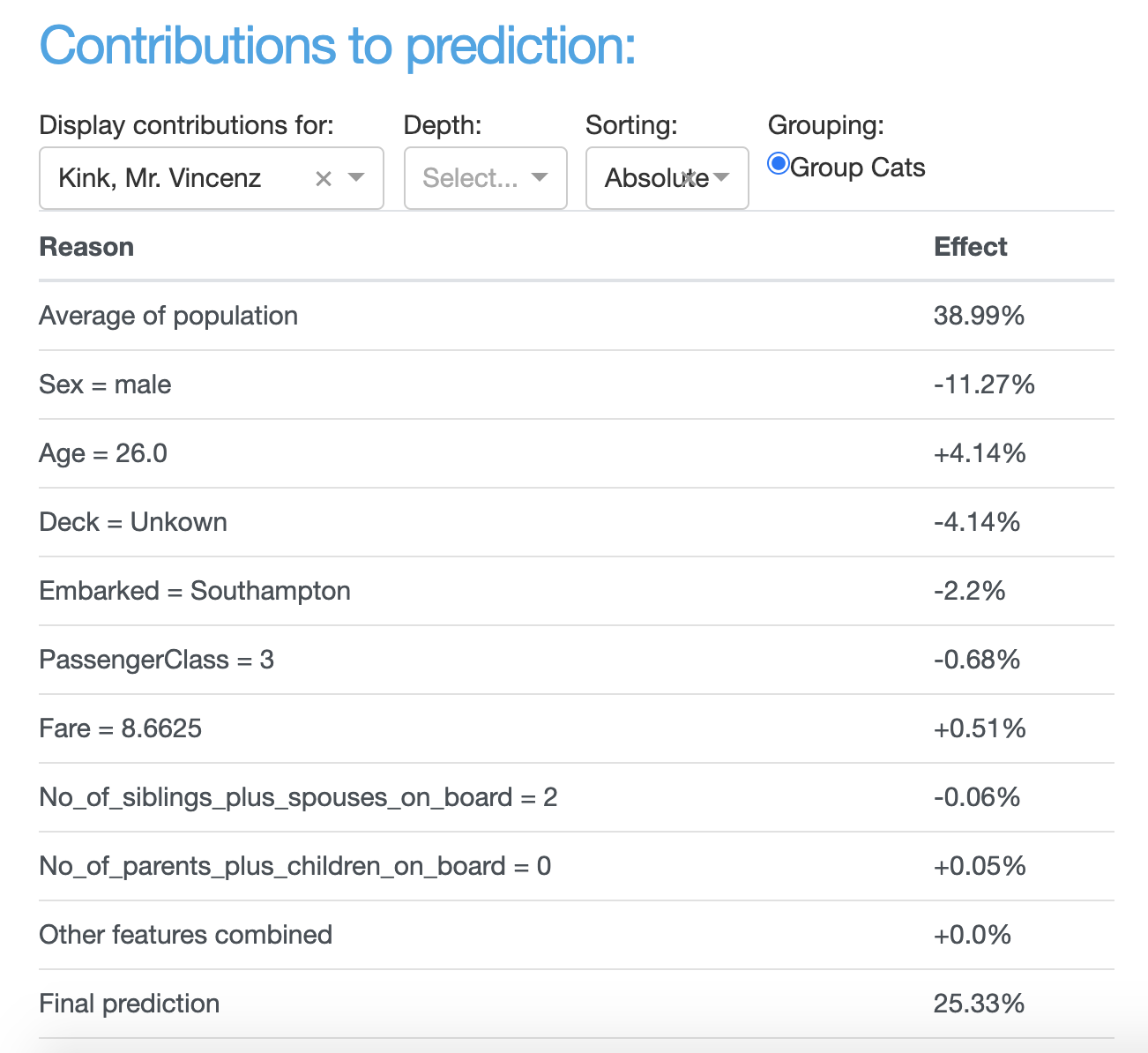
ShapContributionsTableComponent
- class explainerdashboard.dashboard_components.shap_components.ShapContributionsTableComponent(explainer, title='Contributions Table', name=None, subtitle='How has each feature contributed to the prediction?', hide_title=False, hide_subtitle=False, hide_index=False, hide_depth=False, hide_sort=False, hide_selector=False, feature_input_component=None, index_dropdown=True, pos_label=None, index=None, depth=None, sort='abs', description=None, **kwargs)
Show SHAP values contributions to prediction in a table component
- Parameters
explainer (Explainer) – explainer object constructed with either ClassifierExplainer() or RegressionExplainer()
title (str, optional) – Title of tab or page. Defaults to “Contributions Table”.
name (str, optional) – unique name to add to Component elements. If None then random uuid is generated to make sure it’s unique. Defaults to None.
subtitle (str) – subtitle
hide_title (bool, optional) – Hide component title. Defaults to False.
hide_subtitle (bool, optional) – Hide subtitle. Defaults to False.
hide_index (bool, optional) – Hide index selector. Defaults to False.
hide_depth (bool, optional) – Hide depth selector. Defaults to False.
hide_sort (bool, optional) – Hide sorting dropdown. Default to False.
hide_selector (bool, optional) – hide pos label selector. Defaults to False.
feature_input_component (FeatureInputComponent) – A FeatureInputComponent that will give the input to the graph instead of the index selector. If not None, hide_index=True. Defaults to None.
index_dropdown (bool, optional) – Use dropdown for index input instead of free text input. Defaults to True.
pos_label ({int, str}, optional) – initial pos label. Defaults to explainer.pos_label
index ([type], optional) – Initial index to display. Defaults to None.
depth ([type], optional) – Initial number of features to display. Defaults to None.
sort ({'abs', 'high-to-low', 'low-to-high', 'importance'}, optional) – sorting of shap values. Defaults to ‘high-to-low’.
description (str, optional) – Tooltip to display when hover over component title. When None default text is shown.
- layout()
layout to be defined by the particular ExplainerComponent instance. All element id’s should append +self.name to make sure they are unique.
- get_state_tuples()
returns a list of State (id, property) tuples for the component and all subcomponents
- to_html(state_dict=None, add_header=True)
return static html for this component and all subcomponents.
- Parameters
state_dict (dict) – dictionary with id_prop_tuple as keys and state as value.
- component_callbacks(app)
register callbacks specific to this ExplainerComponent.
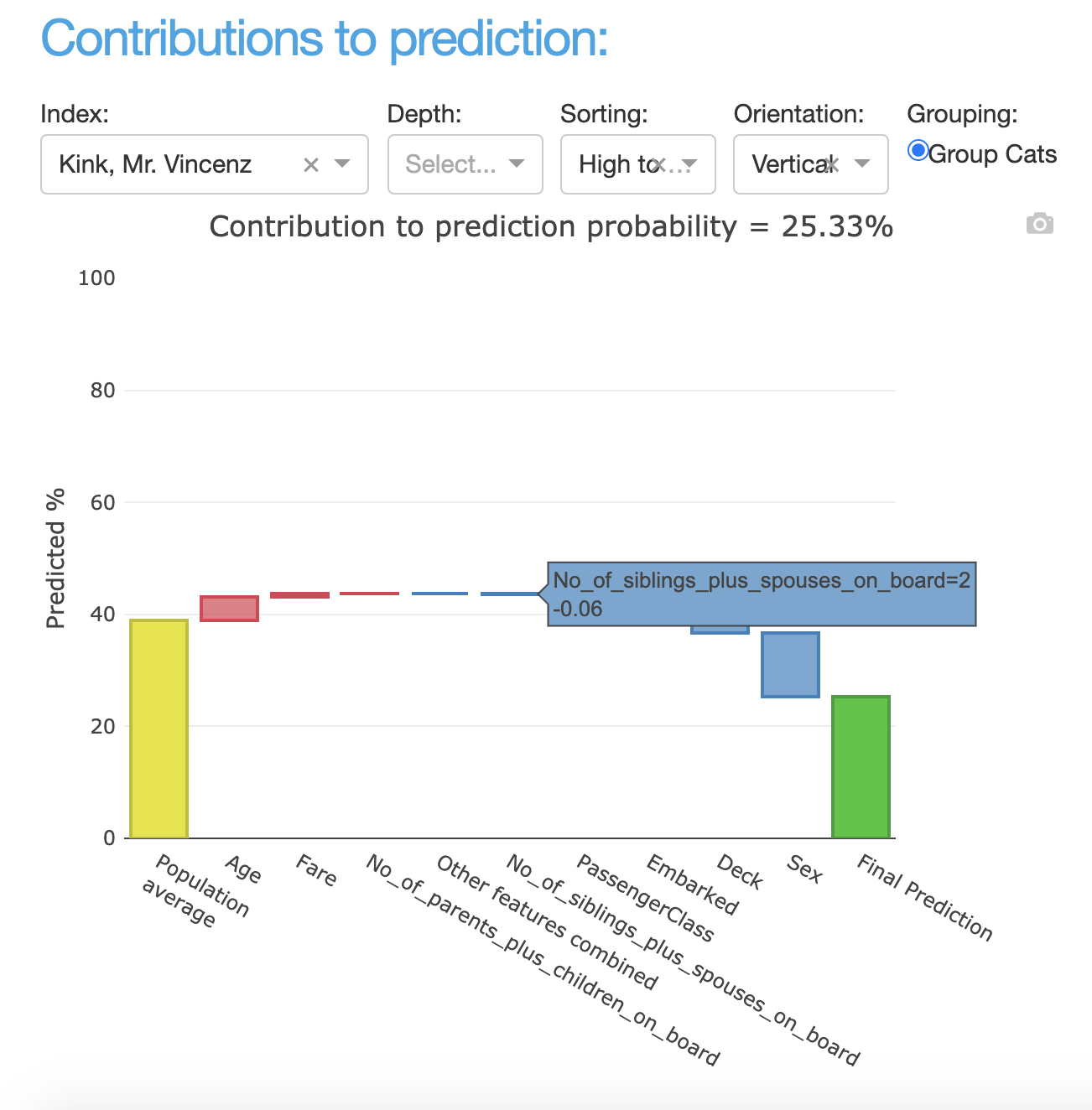
ShapContributionsGraphComponent
- class explainerdashboard.dashboard_components.shap_components.ShapContributionsGraphComponent(explainer, title='Contributions Plot', name=None, subtitle='How has each feature contributed to the prediction?', hide_title=False, hide_subtitle=False, hide_index=False, hide_depth=False, hide_sort=False, hide_orientation=True, hide_selector=False, hide_popout=False, feature_input_component=None, index_dropdown=True, pos_label=None, index=None, depth=None, sort='high-to-low', orientation='vertical', higher_is_better=True, description=None, **kwargs)
Display Shap contributions to prediction graph component
- Parameters
explainer (Explainer) – explainer object constructed , with either ClassifierExplainer() or RegressionExplainer()
title (str, optional) – Title of tab or page. Defaults to “Contributions Plot”.
name (str, optional) – unique name to add to Component elements. If None then random uuid is generated to make sure it’s unique. Defaults to None.
subtitle (str) – subtitle
hide_title (bool, optional) – Hide component title. Defaults to False.
hide_subtitle (bool, optional) – Hide subtitle. Defaults to False.
hide_index (bool, optional) – Hide index selector. Defaults to False.
hide_depth (bool, optional) – Hide depth toggle. Defaults to False.
hide_sort (bool, optional) – Hide the sorting dropdown. Defaults to False.
hide_orientation (bool, optional) – Hide the orientation dropdown. Defaults to True.
hide_selector (bool, optional) – hide pos label selector. Defaults to False.
hide_popout (bool, optional) – hide popout button
feature_input_component (FeatureInputComponent) – A FeatureInputComponent that will give the input to the graph instead of the index selector. If not None, hide_index=True. Defaults to None.
index_dropdown (bool, optional) – Use dropdown for index input instead of free text input. Defaults to True.
pos_label ({int, str}, optional) – initial pos label. Defaults to explainer.pos_label
index ({int, bool}, optional) – Initial index to display. Defaults to None.
depth (int, optional) – Initial number of features to display. Defaults to None.
sort ({'abs', 'high-to-low', 'low-to-high', 'importance'}, optional) – sorting of shap values. Defaults to ‘high-to-low’.
orientation ({'vertical', 'horizontal'}, optional) – orientation of bar chart. Defaults to ‘vertical’.
higher_is_better (bool, optional) – Color positive shap values green and negative shap values red, or the reverse.
description (str, optional) – Tooltip to display when hover over component title. When None default text is shown.
- layout()
layout to be defined by the particular ExplainerComponent instance. All element id’s should append +self.name to make sure they are unique.
- get_state_tuples()
returns a list of State (id, property) tuples for the component and all subcomponents
- to_html(state_dict=None, add_header=True)
return static html for this component and all subcomponents.
- Parameters
state_dict (dict) – dictionary with id_prop_tuple as keys and state as value.
- component_callbacks(app)
register callbacks specific to this ExplainerComponent.
overview_components
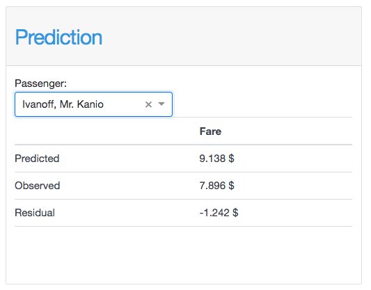
PredictionSummaryComponent
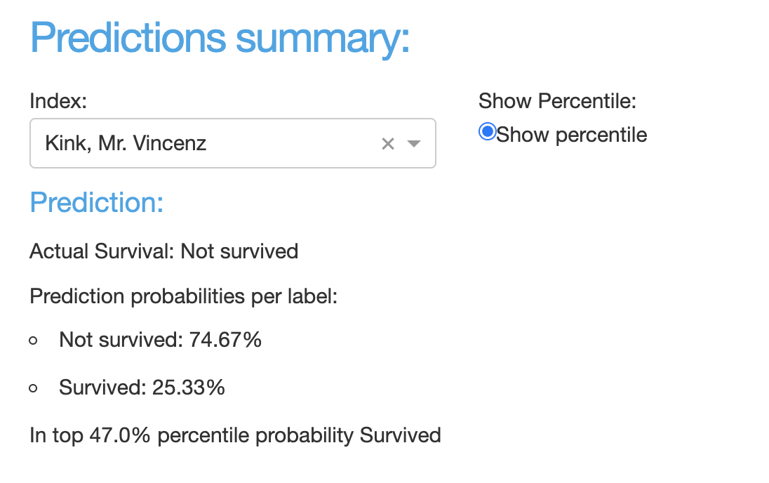
- class explainerdashboard.dashboard_components.overview_components.PredictionSummaryComponent(explainer, title='Prediction Summary', name=None, hide_index=False, hide_percentile=False, hide_title=False, hide_subtitle=False, hide_selector=False, pos_label=None, index=None, percentile=True, description=None, **kwargs)
Shows a summary for a particular prediction
- Parameters
explainer (Explainer) – explainer object constructed with either ClassifierExplainer() or RegressionExplainer()
title (str, optional) – Title of tab or page. Defaults to “Prediction Summary”.
name (str, optional) – unique name to add to Component elements. If None then random uuid is generated to make sure it’s unique. Defaults to None.
hide_index (bool, optional) – hide index selector. Defaults to False.
hide_percentile (bool, optional) – hide percentile toggle. Defaults to False.
hide_title (bool, optional) – hide title. Defaults to False.
hide_subtitle (bool, optional) – Hide subtitle. Defaults to False.
hide_selector (bool, optional) – hide pos label selectors. Defaults to False.
pos_label ({int, str}, optional) – initial pos label. Defaults to explainer.pos_label
index ({int, str}, optional) – Index to display prediction summary for. Defaults to None.
percentile (bool, optional) – Whether to add the prediction percentile. Defaults to True.
- layout()
layout to be defined by the particular ExplainerComponent instance. All element id’s should append +self.name to make sure they are unique.
- component_callbacks(app)
register callbacks specific to this ExplainerComponent.
ImportancesComponent
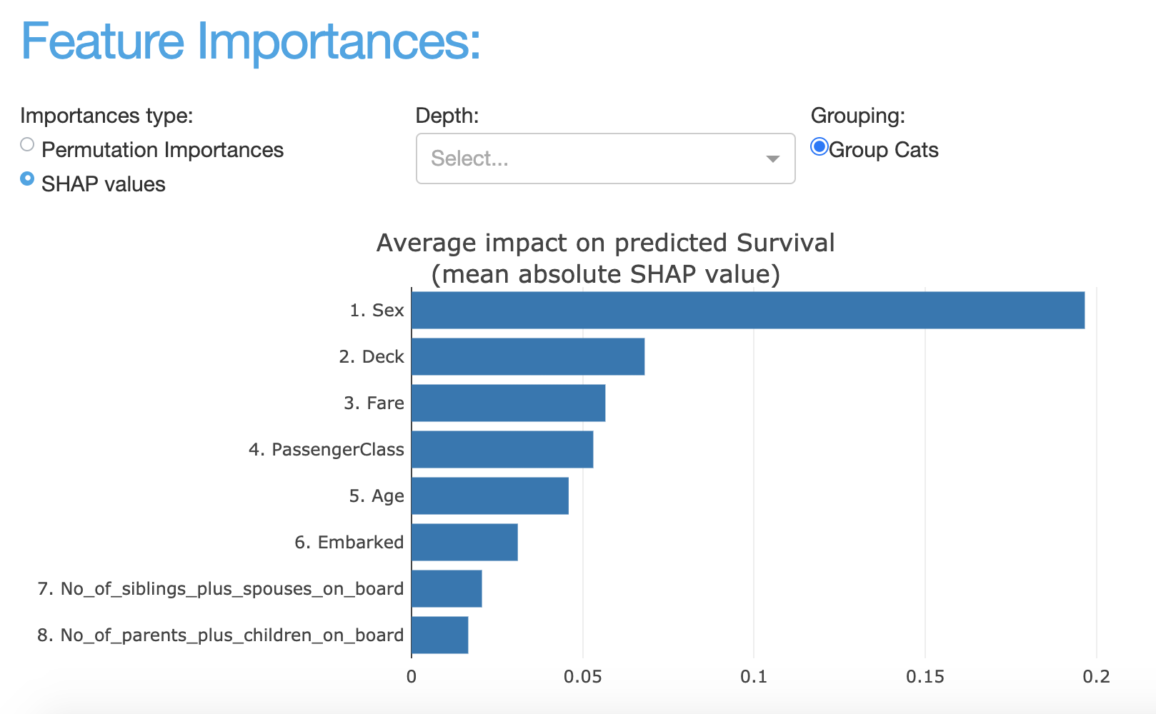
- class explainerdashboard.dashboard_components.overview_components.ImportancesComponent(explainer, title='Feature Importances', name=None, subtitle='Which features had the biggest impact?', hide_type=False, hide_depth=False, hide_popout=False, hide_title=False, hide_subtitle=False, hide_selector=False, pos_label=None, importance_type='shap', depth=None, no_permutations=False, description=None, **kwargs)
Display features importances component
- Parameters
explainer (Explainer) – explainer object constructed with either ClassifierExplainer() or RegressionExplainer()
title (str, optional) – Title of tab or page. Defaults to “Feature Importances”.
name (str, optional) – unique name to add to Component elements. If None then random uuid is generated to make sure it’s unique. Defaults to None.
subtitle (str, optional) – Subtitle.
hide_type (bool, optional) – Hide permutation/shap selector toggle. Defaults to False.
hide_depth (bool, optional) – Hide number of features toggle. Defaults to False.
hide_popout (bool, optional) – hide popout button
hide_title (bool, optional) – hide title. Defaults to False.
hide_subtitle (bool, optional) – Hide subtitle. Defaults to False.
hide_selector (bool, optional) – hide pos label selectors. Defaults to False.
pos_label ({int, str}, optional) – initial pos label. Defaults to explainer.pos_label
importance_type (str, {'permutation', 'shap'} optional) – initial importance type to display. Defaults to “shap”.
depth (int, optional) – Initial number of top features to display. Defaults to None (=show all).
no_permutations (bool, optional) – Do not use the permutation importances for this component. Defaults to False.
description (str, optional) – Tooltip to display when hover over component title. When None default text is shown.
- layout()
layout to be defined by the particular ExplainerComponent instance. All element id’s should append +self.name to make sure they are unique.
- to_html(state_dict=None, add_header=True)
return static html for this component and all subcomponents.
- Parameters
state_dict (dict) – dictionary with id_prop_tuple as keys and state as value.
- component_callbacks(app, **kwargs)
register callbacks specific to this ExplainerComponent.
FeatureDescriptionsComponent
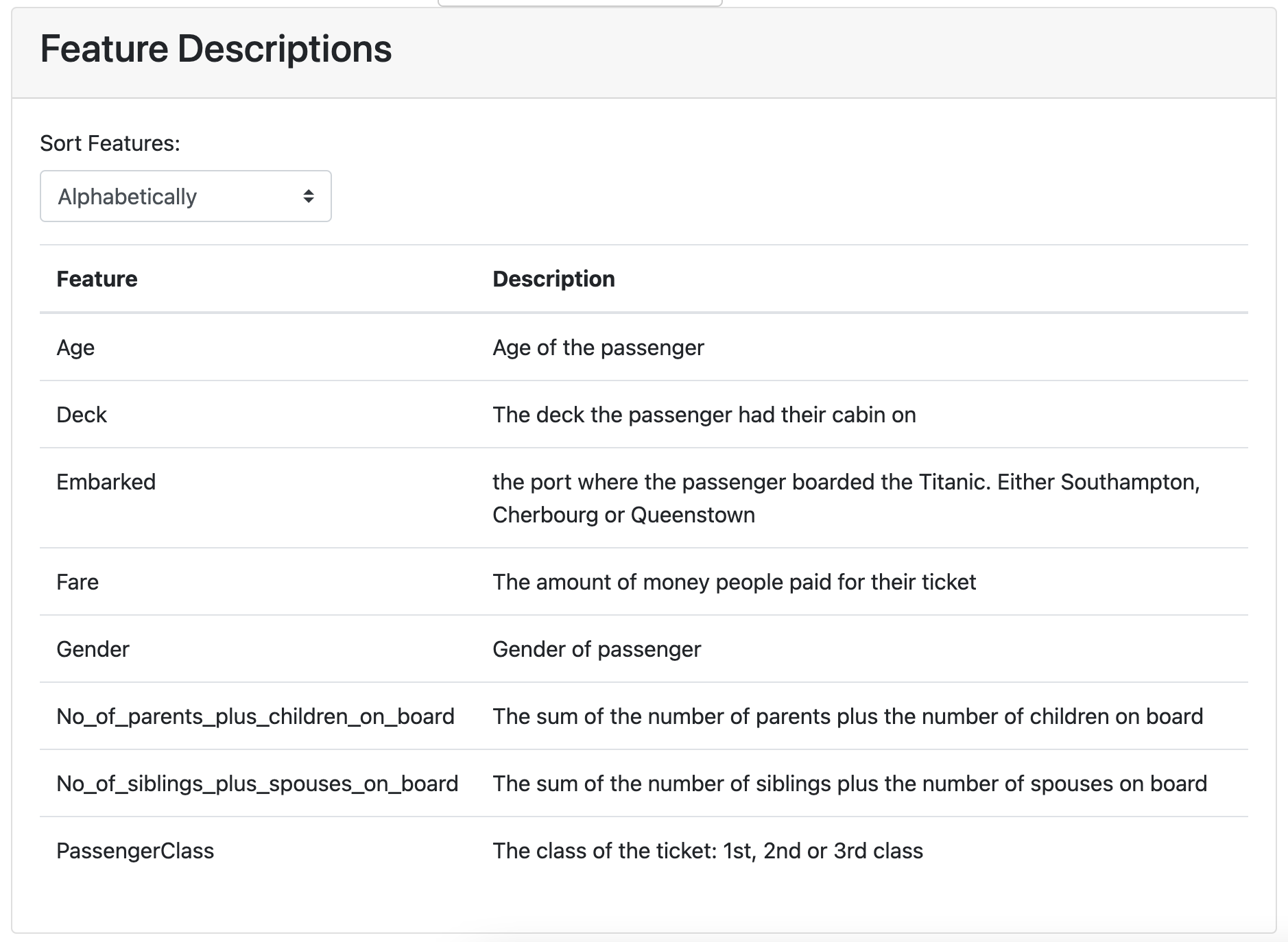
- class explainerdashboard.dashboard_components.overview_components.FeatureDescriptionsComponent(explainer, title='Feature Descriptions', name=None, hide_title=False, hide_sort=False, sort='alphabet', **kwargs)
Display Feature Descriptions table.
- Parameters
explainer (Explainer) – explainer object constructed with either ClassifierExplainer() or RegressionExplainer()
title (str, optional) – Title of tab or page. Defaults to “Feature Importances”.
name (str, optional) – unique name to add to Component elements. If None then random uuid is generated to make sure it’s unique. Defaults to None.
hide_title (bool, optional) – hide the title
hide_sort (bool, optional) – hide the sort
sort (str, optional) – how to sort the features, either ‘alphabet’ or by mean abs shap (‘shap’)
- layout()
layout to be defined by the particular ExplainerComponent instance. All element id’s should append +self.name to make sure they are unique.
- to_html(state_dict=None, add_header=True)
return static html for this component and all subcomponents.
- Parameters
state_dict (dict) – dictionary with id_prop_tuple as keys and state as value.
- component_callbacks(app)
register callbacks specific to this ExplainerComponent.
PdpComponent
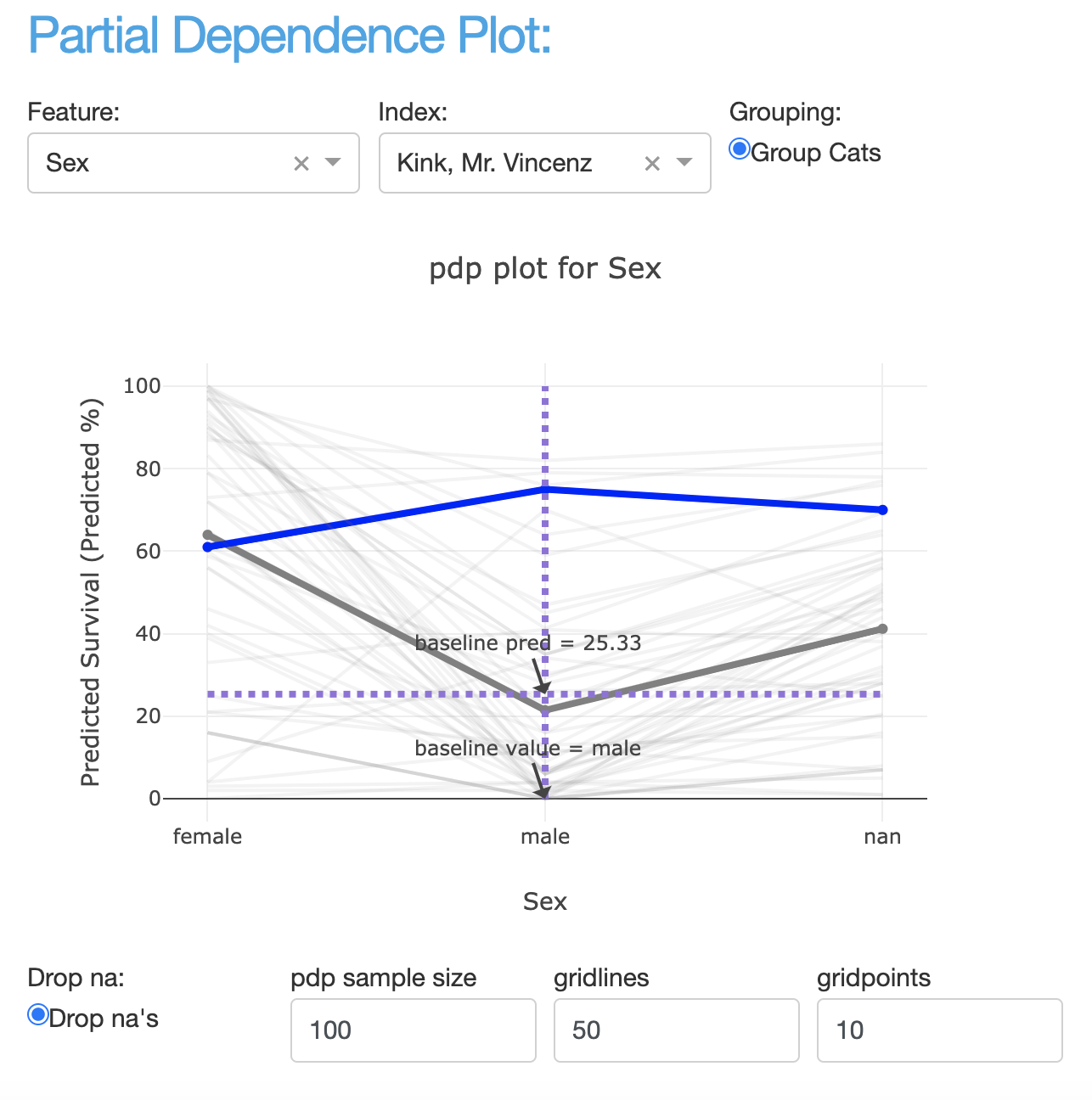
- class explainerdashboard.dashboard_components.overview_components.PdpComponent(explainer, title='Partial Dependence Plot', name=None, subtitle='How does the prediction change if you change one feature?', hide_col=False, hide_index=False, hide_title=False, hide_subtitle=False, hide_footer=False, hide_selector=False, hide_popout=False, hide_dropna=False, hide_sample=False, hide_gridlines=False, hide_gridpoints=False, hide_cats_sort=False, index_dropdown=True, feature_input_component=None, pos_label=None, col=None, index=None, dropna=True, sample=100, gridlines=50, gridpoints=10, cats_sort='freq', description=None, **kwargs)
Show Partial Dependence Plot component
- Parameters
explainer (Explainer) – explainer object constructed with either ClassifierExplainer() or RegressionExplainer()
title (str, optional) – Title of tab or page. Defaults to “Partial Dependence Plot”.
name (str, optional) – unique name to add to Component elements. If None then random uuid is generated to make sure it’s unique. Defaults to None.
subtitle (str) – subtitle
hide_col (bool, optional) – Hide feature selector. Defaults to False.
hide_index (bool, optional) – Hide index selector. Defaults to False.
hide_title (bool, optional) – Hide title, Defaults to False.
hide_subtitle (bool, optional) – Hide subtitle. Defaults to False.
hide_footer (bool, optional) – hide the footer at the bottom of the component
hide_selector (bool, optional) – hide pos label selectors. Defaults to False.
hide_popout (bool, optional) – hide popout button
hide_dropna (bool, optional) – Hide drop na’s toggle Defaults to False.
hide_sample (bool, optional) – Hide sample size input. Defaults to False.
hide_gridlines (bool, optional) – Hide gridlines input. Defaults to False.
hide_gridpoints (bool, optional) – Hide gridpounts input. Defaults to False.
hide_cats_sort (bool, optional) – Hide the categorical sorting dropdown. Defaults to False.
index_dropdown (bool, optional) – Use dropdown for index input instead of free text input. Defaults to True.
feature_input_component (FeatureInputComponent) – A FeatureInputComponent that will give the input to the graph instead of the index selector. If not None, hide_index=True. Defaults to None.
pos_label ({int, str}, optional) – initial pos label. Defaults to explainer.pos_label
col (str, optional) – Feature to display PDP for. Defaults to None.
index ({int, str}, optional) – Index to add ice line to plot. Defaults to None.
dropna (bool, optional) – Drop rows where values equal explainer.na_fill (usually -999). Defaults to True.
sample (int, optional) – Sample size to calculate average partial dependence. Defaults to 100.
gridlines (int, optional) – Number of ice lines to display in plot. Defaults to 50.
gridpoints (int, optional) – Number of breakpoints on horizontal axis Defaults to 10.
cats_sort (str, optional) – how to sort categories: ‘alphabet’, ‘freq’ or ‘shap’. Defaults to ‘freq’.
description (str, optional) – Tooltip to display when hover over component title. When None default text is shown.
- layout()
layout to be defined by the particular ExplainerComponent instance. All element id’s should append +self.name to make sure they are unique.
- get_state_tuples()
returns a list of State (id, property) tuples for the component and all subcomponents
- to_html(state_dict=None, add_header=True)
return static html for this component and all subcomponents.
- Parameters
state_dict (dict) – dictionary with id_prop_tuple as keys and state as value.
- component_callbacks(app)
register callbacks specific to this ExplainerComponent.
FeatureInputComponent
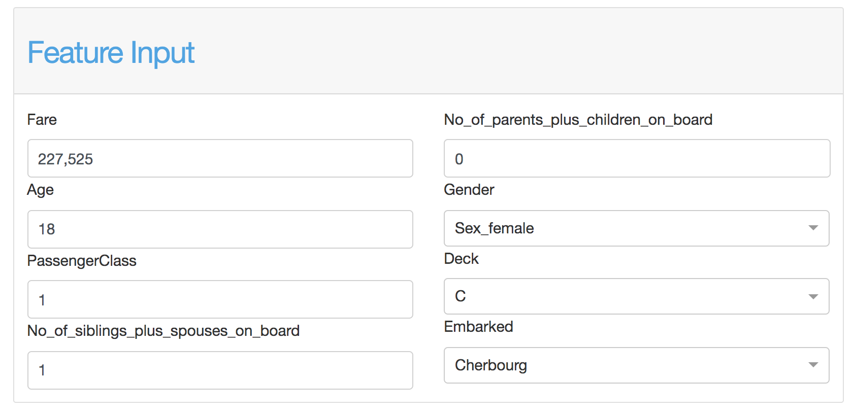
Using the feature input component you can edit the features for a particular observation in order to check what would be the change in prediction if you change one or more features.
You can connect the FeatureInputComponent to the
ShapContributionsGraphComponent and the PdpComponent using
the``feature_input_component`` parameter:
class WhatIfComposite(ExplainerComponent):
   def __init__(self, explainer, title="What if..."):
      super().__init__(explainer, title, name)

      self.input = FeatureInputComponent(explainer)
      self.contrib = ShapContributionsGraphComponent(explainer, feature_input_component=self.input)
      self.pdp = PdpComponent(explainer, feature_input_component=self.input)
- class explainerdashboard.dashboard_components.overview_components.FeatureInputComponent(explainer, title='Feature Input', name=None, subtitle='Adjust the feature values to change the prediction', hide_title=False, hide_subtitle=False, hide_index=False, hide_range=False, index=None, n_input_cols=4, sort_features='shap', fill_row_first=True, description=None, **kwargs)
Interaction Dependence Component.
- Parameters
explainer (Explainer) – explainer object constructed with either ClassifierExplainer() or RegressionExplainer()
title (str, optional) – Title of tab or page. Defaults to “What if…”.
name (str, optional) – unique name to add to Component elements. If None then random uuid is generated to make sure it’s unique. Defaults to None.
subtitle (str) – subtitle
hide_title (bool, optional) – hide the title
hide_subtitle (bool, optional) – Hide subtitle. Defaults to False.
hide_index (bool, optional) – hide the index selector
hide_range (bool, optional) – hide the range label under the inputs
index (str, int, optional) – default index
n_input_cols (int, optional) – number of columns to split features inputs in. Defaults to 4.
sort_features (str, optional) – how to sort the features. For now only options is ‘shap’ to sort by mean absolute shap value.
fill_row_first (bool, optional) – if True most important features will be on top row, if False they will be in most left column.
description (str, optional) – Tooltip to display when hover over component title. When None default text is shown.
- get_slices_cols_first(n_inputs, n_cols=2)
returns a list of slices to divide n inputs into n_cols columns, filling columns first
- get_slices_rows_first(n_inputs, n_cols=3)
returns a list of slices to divide n inputs into n_cols columns, filling columns first
- layout()
layout to be defined by the particular ExplainerComponent instance. All element id’s should append +self.name to make sure they are unique.
- to_html(state_dict=None, add_header=True)
return static html for this component and all subcomponents.
- Parameters
state_dict (dict) – dictionary with id_prop_tuple as keys and state as value.
- component_callbacks(app)
register callbacks specific to this ExplainerComponent.
classifier_components
ClassifierRandomIndexComponent
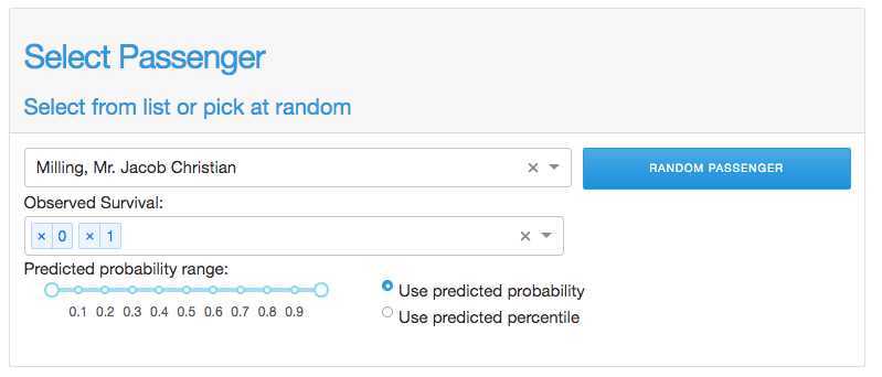
- class explainerdashboard.dashboard_components.classifier_components.ClassifierRandomIndexComponent(explainer, title='Select Random Index', name=None, subtitle='Select from list or pick at random', hide_title=False, hide_subtitle=False, hide_index=False, hide_slider=False, hide_labels=False, hide_pred_or_perc=False, hide_selector=False, hide_button=False, index_dropdown=True, pos_label=None, index=None, slider=None, labels=None, pred_or_perc='predictions', description=None, **kwargs)
Select a random index subject to constraints component
- Parameters
explainer (Explainer) – explainer object constructed with either ClassifierExplainer() or RegressionExplainer()
title (str, optional) – Title of tab or page. Defaults to “Select Random Index”.
name (str, optional) – unique name to add to Component elements. If None then random uuid is generated to make sure it’s unique. Defaults to None.
subtitle (str) – subtitle
hide_title (bool, optional) – Hide title. Defaults to False.
hide_subtitle (bool, optional) – Hide subtitle. Defaults to False.
hide_index (bool, optional) – Hide index selector. Defaults to False.
hide_slider (bool, optional) – Hide prediction/percentile slider. Defaults to False.
hide_labels (bool, optional) – Hide label selector Defaults to False.
hide_pred_or_perc (bool, optional) – Hide prediction/percentiles toggle. Defaults to False.
hide_selector (bool, optional) – hide pos label selectors. Defaults to False.
hide_button (bool, optional) – Hide button. Defaults to False.
index_dropdown (bool, optional) – Use dropdown for index input instead of free text input. Defaults to True.
pos_label ({int, str}, optional) – initial pos label. Defaults to explainer.pos_label
index ({str, int}, optional) – Initial index to display. Defaults to None.
slider ([float,float], optional) – initial slider position [lower bound, upper bound]. Defaults to None.
labels ([str], optional) – list of initial labels(str) to include. Defaults to None.
pred_or_perc (str, optional) – Whether to use prediction or percentiles slider. Defaults to ‘predictions’.
description (str, optional) – Tooltip to display when hover over component title. When None default text is shown.
- layout()
layout to be defined by the particular ExplainerComponent instance. All element id’s should append +self.name to make sure they are unique.
- to_html(state_dict=None, add_header=True)
return static html for this component and all subcomponents.
- Parameters
state_dict (dict) – dictionary with id_prop_tuple as keys and state as value.
- component_callbacks(app)
register callbacks specific to this ExplainerComponent.
ClassifierPredictionSummaryComponent
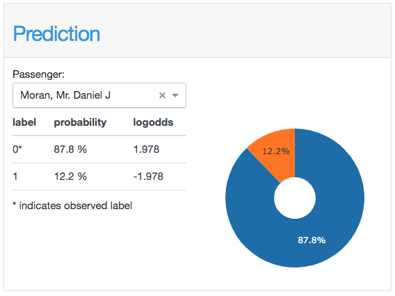
- class explainerdashboard.dashboard_components.classifier_components.ClassifierPredictionSummaryComponent(explainer, title='Prediction', name=None, hide_index=False, hide_title=False, hide_subtitle=False, hide_table=False, hide_piechart=False, hide_star_explanation=False, hide_selector=False, index_dropdown=True, feature_input_component=None, pos_label=None, index=None, round=3, description=None, **kwargs)
Shows a summary for a particular prediction
- Parameters
explainer (Explainer) – explainer object constructed with either ClassifierExplainer() or RegressionExplainer()
title (str, optional) – Title of tab or page. Defaults to “Prediction Summary”.
name (str, optional) – unique name to add to Component elements. If None then random uuid is generated to make sure it’s unique. Defaults to None.
hide_index (bool, optional) – hide index selector. Defaults to False.
hide_title (bool, optional) – hide title. Defaults to False.
hide_subtitle (bool, optional) – Hide subtitle. Defaults to False.
hide_table (bool, optional) – hide the results table
hide_piechart (bool, optional) – hide the results piechart
hide_star_explanation (bool, optional) – hide the * indicates.. Defaults to False.
hide_selector (bool, optional) – hide pos label selectors. Defaults to False.
index_dropdown (bool, optional) – Use dropdown for index input instead of free text input. Defaults to True.
feature_input_component (FeatureInputComponent) – A FeatureInputComponent that will give the input to the graph instead of the index selector. If not None, hide_index=True. Defaults to None.
pos_label ({int, str}, optional) – initial pos label. Defaults to explainer.pos_label
index ({int, str}, optional) – Index to display prediction summary for. Defaults to None.
round (int, optional) – rounding to apply to pred_proba float. Defaults to 3.
description (str, optional) – Tooltip to display when hover over component title. When None default text is shown.
- layout()
layout to be defined by the particular ExplainerComponent instance. All element id’s should append +self.name to make sure they are unique.
- get_state_tuples()
returns a list of State (id, property) tuples for the component and all subcomponents
- to_html(state_dict=None, add_header=True)
return static html for this component and all subcomponents.
- Parameters
state_dict (dict) – dictionary with id_prop_tuple as keys and state as value.
- component_callbacks(app)
register callbacks specific to this ExplainerComponent.
ConfusionMatrixComponent
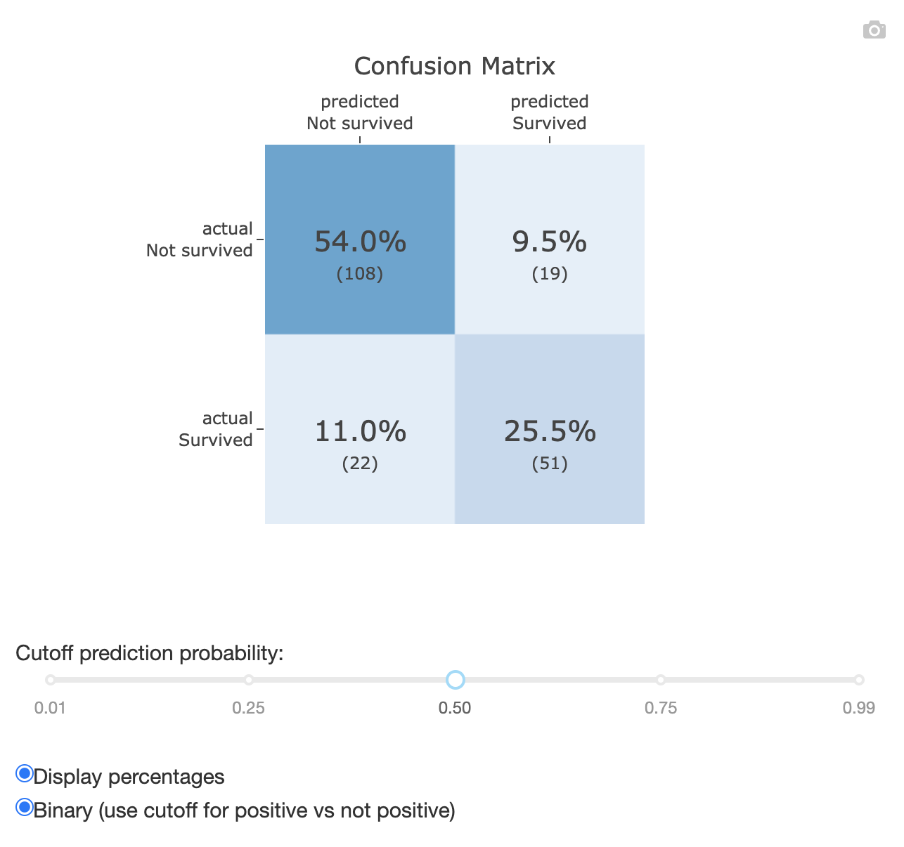
- class explainerdashboard.dashboard_components.classifier_components.ConfusionMatrixComponent(explainer, title='Confusion Matrix', name=None, subtitle='How many false positives and false negatives?', hide_title=False, hide_subtitle=False, hide_footer=False, hide_cutoff=False, hide_percentage=False, hide_binary=False, hide_selector=False, hide_popout=False, hide_normalize=False, normalize='all', pos_label=None, cutoff=0.5, percentage=True, binary=True, description=None, **kwargs)
Display confusion matrix component
- Parameters
explainer (Explainer) – explainer object constructed with either ClassifierExplainer() or RegressionExplainer()
title (str, optional) – Title of tab or page. Defaults to “Confusion Matrix”.
name (str, optional) – unique name to add to Component elements. If None then random uuid is generated to make sure it’s unique. Defaults to None.
subtitle (str) – subtitle
hide_title (bool, optional) – hide title.
hide_subtitle (bool, optional) – Hide subtitle. Defaults to False.
hide_footer (bool, optional) – hide the footer at the bottom of the component
hide_cutoff (bool, optional) – Hide cutoff slider. Defaults to False.
hide_percentage (bool, optional) – Hide percentage toggle. Defaults to False.
hide_binary (bool, optional) – Hide binary toggle. Defaults to False.
hide_selector (bool, optional) – hide pos label selector. Defaults to False.
hide_popout (bool, optional) – hide popout button. Defaults to False.
pos_label ({int, str}, optional) – initial pos label. Defaults to explainer.pos_label
cutoff (float, optional) – Default cutoff. Defaults to 0.5.
percentage (bool, optional) – Display percentages instead of counts. Defaults to True.
binary (bool, optional) – Show binary instead of multiclass confusion matrix. Defaults to True.
description (str, optional) – Tooltip to display when hover over component title. When None default text is shown.
normalize (str[‘true’, ‘pred’, ‘all’]) – normalizes confusion matrix over the true (rows), predicted (columns) conditions or all the population. Defaults to all
- layout()
layout to be defined by the particular ExplainerComponent instance. All element id’s should append +self.name to make sure they are unique.
- to_html(state_dict=None, add_header=True)
return static html for this component and all subcomponents.
- Parameters
state_dict (dict) – dictionary with id_prop_tuple as keys and state as value.
- component_callbacks(app)
register callbacks specific to this ExplainerComponent.
LiftCurveComponent
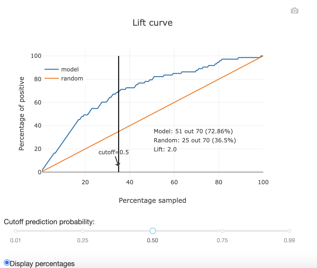
- class explainerdashboard.dashboard_components.classifier_components.LiftCurveComponent(explainer, title='Lift Curve', name=None, subtitle='Performance how much better than random?', hide_title=False, hide_subtitle=False, hide_footer=False, hide_cutoff=False, hide_percentage=False, hide_wizard=False, hide_selector=False, hide_popout=False, pos_label=None, cutoff=0.5, percentage=True, wizard=True, description=None, **kwargs)
Show liftcurve component
- Parameters
explainer (Explainer) – explainer object constructed with either ClassifierExplainer() or RegressionExplainer()
title (str, optional) – Title of tab or page. Defaults to “Lift Curve”.
name (str, optional) – unique name to add to Component elements. If None then random uuid is generated to make sure it’s unique. Defaults to None.
subtitle (str) – subtitle
hide_title (bool, optional) – hide title.
hide_subtitle (bool, optional) – Hide subtitle. Defaults to False.
hide_footer (bool, optional) – hide the footer at the bottom of the component
hide_cutoff (bool, optional) – Hide cutoff slider. Defaults to False.
hide_percentage (bool, optional) – Hide percentage toggle. Defaults to False.
hide_wizard (bool, optional) – hide the wizard toggle. Defaults to False.
hide_selector (bool, optional) – hide pos label selector. Defaults to False.
hide_popout (bool, optional) – hide popout button. Defaults to False.
pos_label ({int, str}, optional) – initial pos label. Defaults to explainer.pos_label
cutoff (float, optional) – Cutoff for lift curve. Defaults to 0.5.
percentage (bool, optional) – Display percentages instead of counts. Defaults to True.
wizard (bool, optional) – display the wizard in the graph.
description (str, optional) – Tooltip to display when hover over component title. When None default text is shown.
- layout()
layout to be defined by the particular ExplainerComponent instance. All element id’s should append +self.name to make sure they are unique.
- to_html(state_dict=None, add_header=True)
return static html for this component and all subcomponents.
- Parameters
state_dict (dict) – dictionary with id_prop_tuple as keys and state as value.
- component_callbacks(app)
register callbacks specific to this ExplainerComponent.
ClassificationComponent
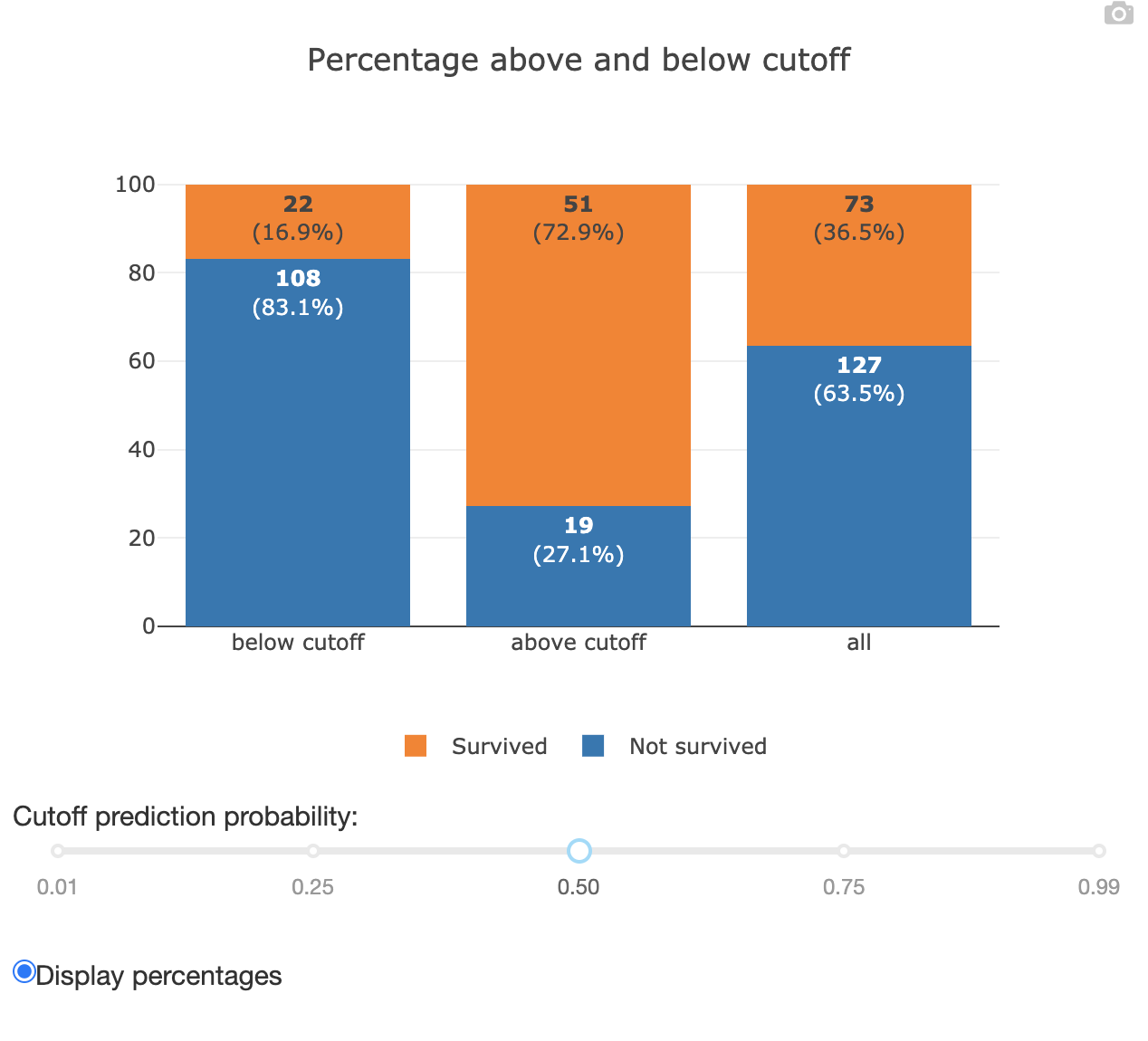
- class explainerdashboard.dashboard_components.classifier_components.ClassificationComponent(explainer, title='Classification Plot', name=None, subtitle='Distribution of labels above and below cutoff', hide_title=False, hide_subtitle=False, hide_footer=False, hide_cutoff=False, hide_percentage=False, hide_selector=False, hide_popout=False, pos_label=None, cutoff=0.5, percentage=True, description=None, **kwargs)
Shows a barchart of the number of classes above the cutoff and below the cutoff.
- Parameters
explainer (Explainer) – explainer object constructed with either ClassifierExplainer() or RegressionExplainer()
title (str, optional) – Title of tab or page. Defaults to “Classification Plot”.
name (str, optional) – unique name to add to Component elements. If None then random uuid is generated to make sure it’s unique. Defaults to None.
subtitle (str) – subtitle
hide_title (bool, optional) – hide the title.
hide_subtitle (bool, optional) – Hide subtitle. Defaults to False.
hide_footer (bool, optional) – hide the footer at the bottom of the component
hide_cutoff (bool, optional) – Hide cutoff slider. Defaults to False.
hide_percentage (bool, optional) – Hide percentage toggle. Defaults to False.
hide_selector (bool, optional) – hide pos label selector. Defaults to False.
hide_popout (bool, optional) – hide popout button. Defaults to False.
pos_label ({int, str}, optional) – initial pos label. Defaults to explainer.pos_label
cutoff (float, optional) – Cutoff for prediction. Defaults to 0.5.
percentage (bool, optional) – Show percentage instead of counts. Defaults to True.
description (str, optional) – Tooltip to display when hover over component title. When None default text is shown.
- layout()
layout to be defined by the particular ExplainerComponent instance. All element id’s should append +self.name to make sure they are unique.
- to_html(state_dict=None, add_header=True)
return static html for this component and all subcomponents.
- Parameters
state_dict (dict) – dictionary with id_prop_tuple as keys and state as value.
- component_callbacks(app)
register callbacks specific to this ExplainerComponent.
RocAucComponent
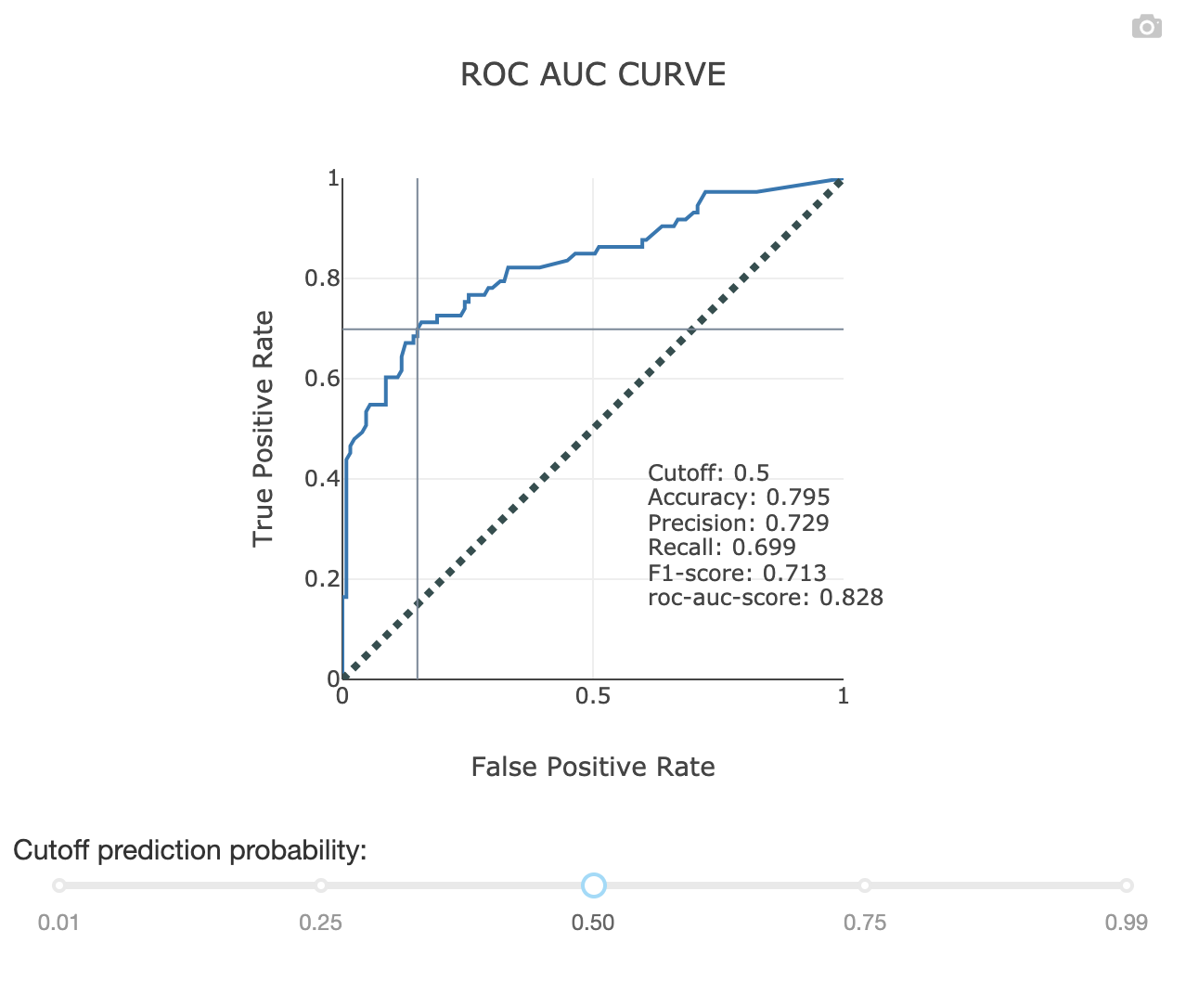
- class explainerdashboard.dashboard_components.classifier_components.RocAucComponent(explainer, title='ROC AUC Plot', name=None, subtitle='Trade-off between False positives and false negatives', hide_title=False, hide_subtitle=False, hide_footer=False, hide_cutoff=False, hide_selector=False, hide_popout=False, pos_label=None, cutoff=0.5, description=None, **kwargs)
Show ROC AUC curve component
- Parameters
explainer (Explainer) – explainer object constructed with either ClassifierExplainer() or RegressionExplainer()
title (str, optional) – Title of tab or page. Defaults to “ROC AUC Plot”.
name (str, optional) – unique name to add to Component elements. If None then random uuid is generated to make sure it’s unique. Defaults to None.
subtitle (str) – subtitle
hide_title (bool, optional) – hide title.
hide_subtitle (bool, optional) – Hide subtitle. Defaults to False.
hide_footer (bool, optional) – hide the footer at the bottom of the component
hide_cutoff (bool, optional) – Hide cutoff slider. Defaults to False.
hide_selector (bool, optional) – hide pos label selector. Defaults to False.
hide_popout (bool, optional) – hide popout button. Defaults to False.
pos_label ({int, str}, optional) – initial pos label. Defaults to explainer.pos_label
cutoff (float, optional) – default cutoff. Defaults to 0.5.
- layout()
layout to be defined by the particular ExplainerComponent instance. All element id’s should append +self.name to make sure they are unique.
- to_html(state_dict=None, add_header=True)
return static html for this component and all subcomponents.
- Parameters
state_dict (dict) – dictionary with id_prop_tuple as keys and state as value.
- component_callbacks(app)
register callbacks specific to this ExplainerComponent.
PrAucComponent
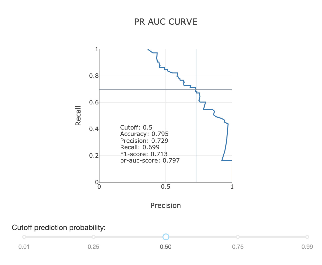
- class explainerdashboard.dashboard_components.classifier_components.PrAucComponent(explainer, title='PR AUC Plot', name=None, subtitle='Trade-off between Precision and Recall', hide_title=False, hide_subtitle=False, hide_footer=False, hide_cutoff=False, hide_selector=False, hide_popout=False, pos_label=None, cutoff=0.5, description=None, **kwargs)
Display PR AUC plot component
- Parameters
explainer (Explainer) – explainer object constructed with either ClassifierExplainer() or RegressionExplainer()
title (str, optional) – Title of tab or page. Defaults to “PR AUC Plot”.
name (str, optional) – unique name to add to Component elements. If None then random uuid is generated to make sure it’s unique. Defaults to None.
subtitle (str) – subtitle
hide_title (bool, optional) – hide title.
hide_subtitle (bool, optional) – Hide subtitle. Defaults to False.
hide_footer (bool, optional) – hide the footer at the bottom of the component
hide_cutoff (bool, optional) – hide cutoff slider. Defaults to False.
hide_selector (bool, optional) – hide pos label selector. Defaults to False.
hide_popout (bool, optional) – hide popout button. Defaults to False.
pos_label ({int, str}, optional) – initial pos label. Defaults to explainer.pos_label
cutoff (float, optional) – default cutoff. Defaults to 0.5.
description (str, optional) – Tooltip to display when hover over component title. When None default text is shown.
- layout()
layout to be defined by the particular ExplainerComponent instance. All element id’s should append +self.name to make sure they are unique.
- to_html(state_dict=None, add_header=True)
return static html for this component and all subcomponents.
- Parameters
state_dict (dict) – dictionary with id_prop_tuple as keys and state as value.
- component_callbacks(app)
register callbacks specific to this ExplainerComponent.
PrecisionComponent
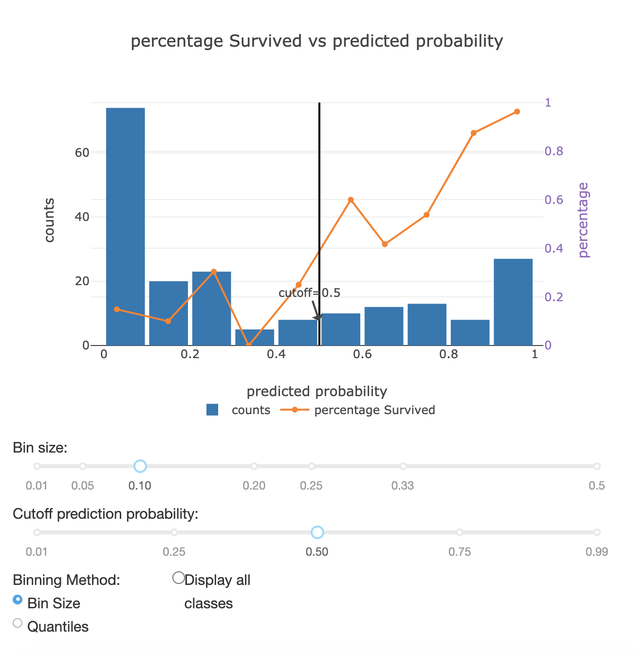
- class explainerdashboard.dashboard_components.classifier_components.PrecisionComponent(explainer, title='Precision Plot', name=None, subtitle='Does fraction positive increase with predicted probability?', hide_title=False, hide_subtitle=False, hide_footer=False, hide_cutoff=False, hide_binsize=False, hide_binmethod=False, hide_multiclass=False, hide_selector=False, hide_popout=False, pos_label=None, bin_size=0.1, quantiles=10, cutoff=0.5, quantiles_or_binsize='bin_size', multiclass=False, description=None, **kwargs)
Shows a precision graph with toggles.
- Parameters
explainer (Explainer) – explainer object constructed with either ClassifierExplainer() or RegressionExplainer()
title (str, optional) – Title of tab or page. Defaults to “Precision Plot”.
name (str, optional) – unique name to add to Component elements. If None then random uuid is generated to make sure it’s unique. Defaults to None.
subtitle (str) – subtitle
hide_title (bool, optional) – hide title
hide_subtitle (bool, optional) – Hide subtitle. Defaults to False.
hide_footer (bool, optional) – hide the footer at the bottom of the component
hide_cutoff (bool, optional) – Hide cutoff slider. Defaults to False.
hide_binsize (bool, optional) – hide binsize/quantiles slider. Defaults to False.
hide_selector (bool, optional) – hide pos label selector. Defaults to False.
hide_binmethod (bool, optional) – Hide binsize/quantiles toggle. Defaults to False.
hide_multiclass (bool, optional) – Hide multiclass toggle. Defaults to False.
hide_selector – Hide pos label selector. Default to True.
hide_popout (bool, optional) – hide popout button
pos_label ({int, str}, optional) – initial pos label. Defaults to explainer.pos_label
bin_size (float, optional) – Size of bins in probability space. Defaults to 0.1.
quantiles (int, optional) – Number of quantiles to divide plot. Defaults to 10.
cutoff (float, optional) – Cutoff to display in graph. Defaults to 0.5.
quantiles_or_binsize (str, {'quantiles', 'bin_size'}, optional) – Default bin method. Defaults to ‘bin_size’.
multiclass (bool, optional) – Display all classes. Defaults to False.
description (str, optional) – Tooltip to display when hover over component title. When None default text is shown.
- layout()
layout to be defined by the particular ExplainerComponent instance. All element id’s should append +self.name to make sure they are unique.
- to_html(state_dict=None, add_header=True)
return static html for this component and all subcomponents.
- Parameters
state_dict (dict) – dictionary with id_prop_tuple as keys and state as value.
- component_callbacks(app)
register callbacks specific to this ExplainerComponent.
CumulativePrecisionComponent
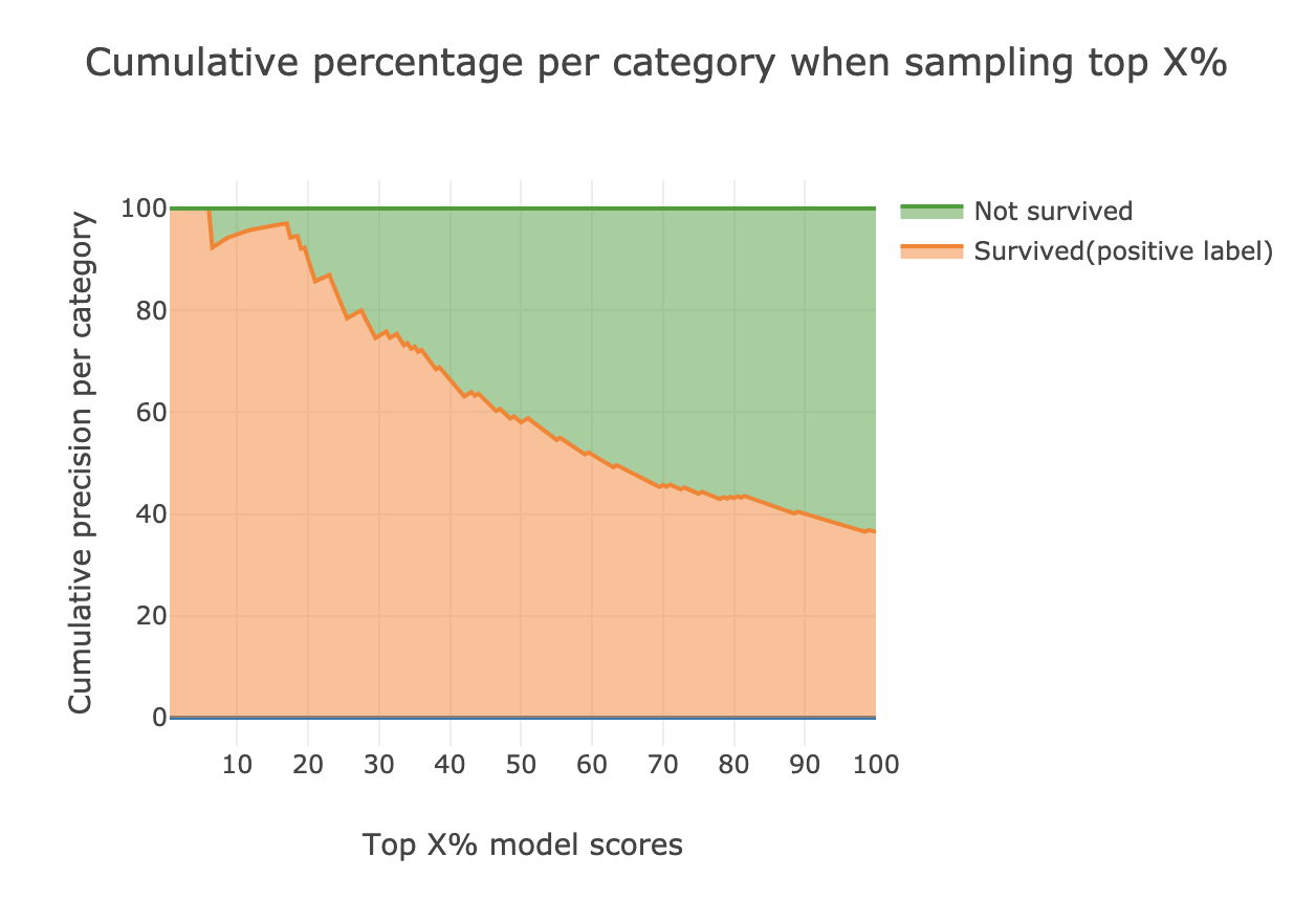
- class explainerdashboard.dashboard_components.classifier_components.CumulativePrecisionComponent(explainer, title='Cumulative Precision', name=None, subtitle='Expected distribution for highest scores', hide_title=False, hide_subtitle=False, hide_footer=False, hide_selector=False, hide_popout=False, pos_label=None, hide_cutoff=False, cutoff=None, hide_percentile=False, percentile=None, description=None, **kwargs)
Show cumulative precision component
- Parameters
explainer (Explainer) – explainer object constructed with either ClassifierExplainer() or RegressionExplainer()
title (str, optional) – Title of tab or page. Defaults to “Cumulative Precision”.
name (str, optional) – unique name to add to Component elements. If None then random uuid is generated to make sure it’s unique. Defaults to None.
subtitle (str) – subtitle
hide_title (bool, optional) – hide the title.
hide_subtitle (bool, optional) – Hide subtitle. Defaults to False.
hide_footer (bool, optional) – hide the footer at the bottom of the component
hide_selector (bool, optional) – hide pos label selector. Defaults to False.
hide_popout (bool, optional) – hide popout button. Defaults to False.
pos_label ({int, str}, optional) – initial pos label. Defaults to explainer.pos_label
- layout()
layout to be defined by the particular ExplainerComponent instance. All element id’s should append +self.name to make sure they are unique.
- to_html(state_dict=None, add_header=True)
return static html for this component and all subcomponents.
- Parameters
state_dict (dict) – dictionary with id_prop_tuple as keys and state as value.
- component_callbacks(app)
register callbacks specific to this ExplainerComponent.
ClassifierModelSummaryComponent
- class explainerdashboard.dashboard_components.classifier_components.ClassifierModelSummaryComponent(explainer, title='Model performance metrics', name=None, hide_title=False, hide_subtitle=False, hide_footer=False, hide_cutoff=False, hide_selector=False, pos_label=None, cutoff=0.5, round=3, show_metrics=None, description=None, **kwargs)
- Show model summary statistics (accuracy, precision, recall,
f1, roc_auc, pr_auc, log_loss) component.
- Parameters
explainer (Explainer) – explainer object constructed with either ClassifierExplainer()
title (str, optional) – Title of tab or page. Defaults to “Model performance metrics”.
name (str, optional) – unique name to add to Component elements. If None then random uuid is generated to make sure it’s unique. Defaults to None.
hide_title (bool, optional) – hide title.
hide_subtitle (bool, optional) – Hide subtitle. Defaults to False.
hide_footer (bool, optional) – hide the footer at the bottom of the component
hide_cutoff (bool, optional) – hide cutoff slider. Defaults to False.
hide_selector (bool, optional) – hide pos label selector. Defaults to False.
pos_label ({int, str}, optional) – initial pos label. Defaults to explainer.pos_label
cutoff (float, optional) – default cutoff. Defaults to 0.5.
round (int) – round floats. Defaults to 3.
show_metrics (List) – list of metrics to display in order. Defaults to None, displaying all metrics.
description (str, optional) – Tooltip to display when hover over component title. When None default text is shown.
- layout()
layout to be defined by the particular ExplainerComponent instance. All element id’s should append +self.name to make sure they are unique.
- to_html(state_dict=None, add_header=True)
return static html for this component and all subcomponents.
- Parameters
state_dict (dict) – dictionary with id_prop_tuple as keys and state as value.
- component_callbacks(app)
register callbacks specific to this ExplainerComponent.
regression_components
RegressionRandomIndexComponent
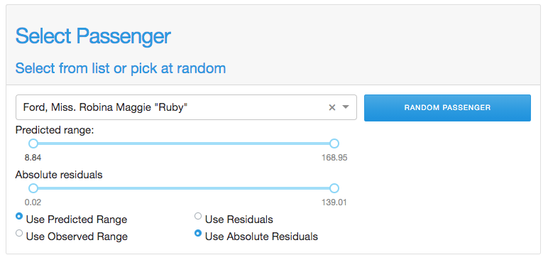
- class explainerdashboard.dashboard_components.regression_components.RegressionRandomIndexComponent(explainer, title=None, name=None, subtitle='Select from list or pick at random', hide_title=False, hide_subtitle=False, hide_index=False, hide_pred_slider=False, hide_residual_slider=False, hide_pred_or_y=False, hide_abs_residuals=False, hide_button=False, index_dropdown=True, index=None, pred_slider=None, y_slider=None, residual_slider=None, abs_residual_slider=None, pred_or_y='preds', abs_residuals=True, round=2, description=None, **kwargs)
Select a random index subject to constraints component
- Parameters
explainer (Explainer) – explainer object constructed with either ClassifierExplainer() or RegressionExplainer()
title (str, optional) – Title of tab or page. Defaults to “Select Random Index”.
name (str, optional) – unique name to add to Component elements. If None then random uuid is generated to make sure it’s unique. Defaults to None.
subtitle (str) – subtitle
hide_title (bool, optional) – hide title
hide_subtitle (bool, optional) – Hide subtitle. Defaults to False.
hide_index (bool, optional) – Hide index selector. Defaults to False.
hide_pred_slider (bool, optional) – Hide prediction slider. Defaults to False.
hide_residual_slider (bool, optional) – hide residuals slider. Defaults to False.
hide_pred_or_y (bool, optional) – hide prediction or actual toggle. Defaults to False.
hide_abs_residuals (bool, optional) – hide absolute residuals toggle. Defaults to False.
hide_button (bool, optional) – hide button. Defaults to False.
index_dropdown (bool, optional) – Use dropdown for index input instead of free text input. Defaults to True.
index ({str, int}, optional) – Initial index to display. Defaults to None.
pred_slider ([lb, ub], optional) – Initial values for prediction values slider [lowerbound, upperbound]. Defaults to None.
y_slider ([lb, ub], optional) – Initial values for y slider [lower bound, upper bound]. Defaults to None.
residual_slider ([lb, ub], optional) – Initial values for residual slider [lower bound, upper bound]. Defaults to None.
abs_residual_slider ([lb, ub], optional) – Initial values for absolute residuals slider [lower bound, upper bound] Defaults to None.
pred_or_y (str, {'preds', 'y'}, optional) – Initial use predictions or y slider. Defaults to “preds”.
abs_residuals (bool, optional) – Initial use residuals or absolute residuals. Defaults to True.
round (int, optional) – rounding used for slider spacing. Defaults to 2.
description (str, optional) – Tooltip to display when hover over component title. When None default text is shown.
- layout()
layout to be defined by the particular ExplainerComponent instance. All element id’s should append +self.name to make sure they are unique.
- to_html(state_dict=None, add_header=True)
return static html for this component and all subcomponents.
- Parameters
state_dict (dict) – dictionary with id_prop_tuple as keys and state as value.
- component_callbacks(app)
register callbacks specific to this ExplainerComponent.
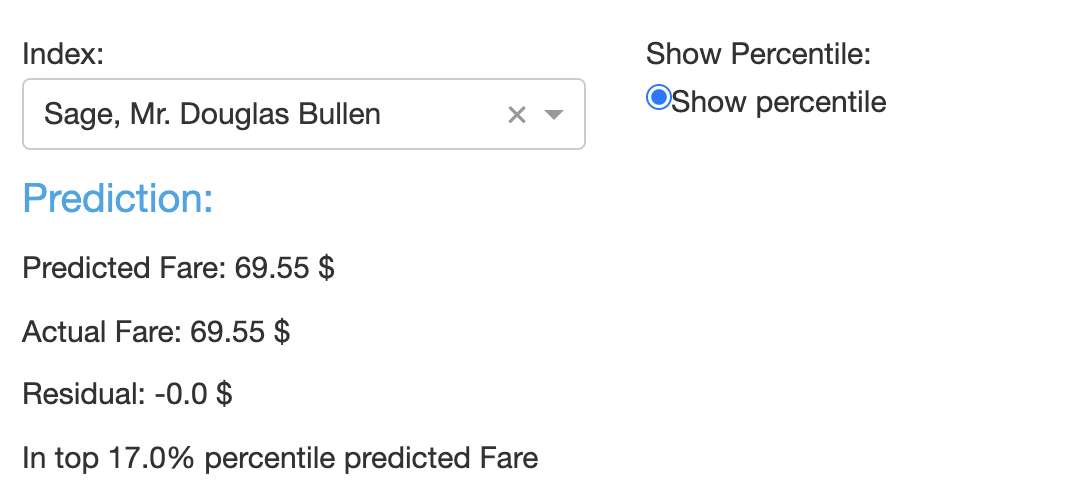
RegressionPredictionSummaryComponent
- class explainerdashboard.dashboard_components.regression_components.RegressionPredictionSummaryComponent(explainer, title='Prediction', name=None, hide_index=False, hide_title=False, hide_subtitle=False, hide_table=False, index_dropdown=True, feature_input_component=None, index=None, round=3, description=None, **kwargs)
Shows a summary for a particular prediction
- Parameters
explainer (Explainer) – explainer object constructed with either ClassifierExplainer() or RegressionExplainer()
title (str, optional) – Title of tab or page. Defaults to “Prediction”.
name (str, optional) – unique name to add to Component elements. If None then random uuid is generated to make sure it’s unique. Defaults to None.
hide_index (bool, optional) – hide index selector. Defaults to False.
hide_title (bool, optional) – hide title. Defaults to False.
hide_subtitle (bool, optional) – Hide subtitle. Defaults to False.
hide_table (bool, optional) – hide the results table
index_dropdown (bool, optional) – Use dropdown for index input instead of free text input. Defaults to True.
feature_input_component (FeatureInputComponent) – A FeatureInputComponent that will give the input to the graph instead of the index selector. If not None, hide_index=True. Defaults to None.
index ({int, str}, optional) – Index to display prediction summary for. Defaults to None.
description (str, optional) – Tooltip to display when hover over component title. When None default text is shown.
- layout()
layout to be defined by the particular ExplainerComponent instance. All element id’s should append +self.name to make sure they are unique.
- get_state_tuples()
returns a list of State (id, property) tuples for the component and all subcomponents
- to_html(state_dict=None, add_header=True)
return static html for this component and all subcomponents.
- Parameters
state_dict (dict) – dictionary with id_prop_tuple as keys and state as value.
- component_callbacks(app)
register callbacks specific to this ExplainerComponent.
PredictedVsActualComponent
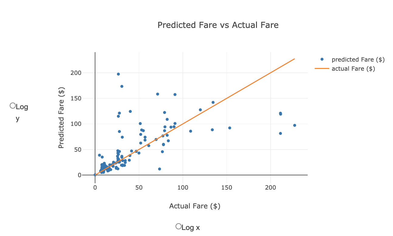
- class explainerdashboard.dashboard_components.regression_components.PredictedVsActualComponent(explainer, title='Predicted vs Actual', name=None, subtitle='How close is the predicted value to the observed?', hide_title=False, hide_subtitle=False, hide_log_x=False, hide_log_y=False, hide_popout=False, logs=False, log_x=False, log_y=False, round=3, plot_sample=None, description=None, **kwargs)
Shows a plot of predictions vs y.
- Parameters
explainer (Explainer) – explainer object constructed with either ClassifierExplainer() or RegressionExplainer()
title (str, optional) – Title of tab or page. Defaults to “Predicted vs Actual”.
name (str, optional) – unique name to add to Component elements. If None then random uuid is generated to make sure it’s unique. Defaults to None.
subtitle (str) – subtitle
hide_title (bool, optional) –
hide_subtitle (bool, optional) – Hide subtitle. Defaults to False.
hide_log_x (bool, optional) – Hide the log_x toggle. Defaults to False.
hide_log_y (bool, optional) – Hide the log_y toggle. Defaults to False.
hide_popout (bool, optional) – hide popout button. Defaults to False.
logs (bool, optional) – Whether to use log axis. Defaults to False.
log_x (bool, optional) – log only x axis. Defaults to False.
log_y (bool, optional) – log only y axis. Defaults to False.
round (int, optional) – rounding to apply to float predictions. Defaults to 3.
plot_sample (int, optional) – Instead of all points only plot a random sample of points. Defaults to None (=all points)
description (str, optional) – Tooltip to display when hover over component title. When None default text is shown.
- layout()
layout to be defined by the particular ExplainerComponent instance. All element id’s should append +self.name to make sure they are unique.
- to_html(state_dict=None, add_header=True)
return static html for this component and all subcomponents.
- Parameters
state_dict (dict) – dictionary with id_prop_tuple as keys and state as value.
- component_callbacks(app)
register callbacks specific to this ExplainerComponent.
ResidualsComponent
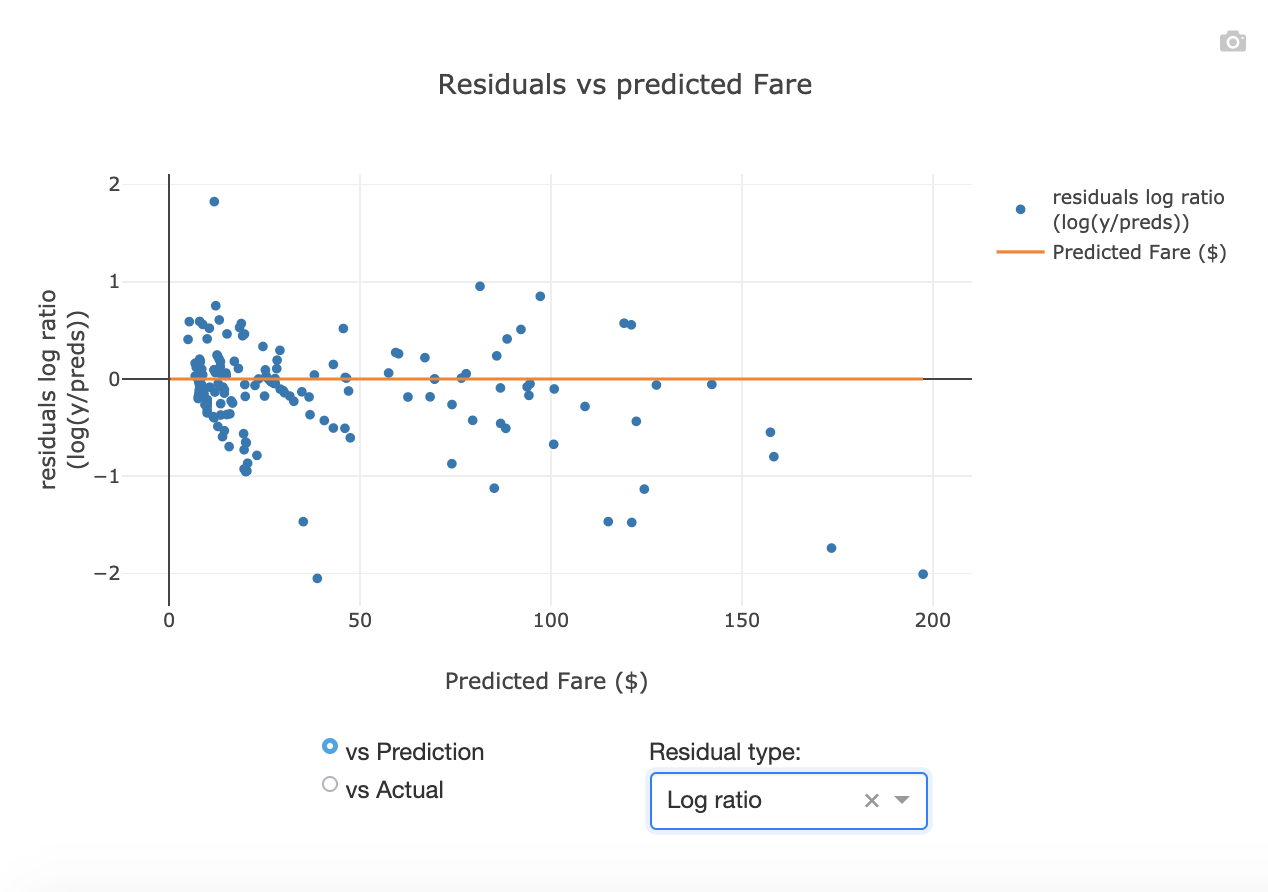
- class explainerdashboard.dashboard_components.regression_components.ResidualsComponent(explainer, title='Residuals', name=None, subtitle='How much is the model off?', hide_title=False, hide_subtitle=False, hide_footer=False, hide_pred_or_actual=False, hide_ratio=False, hide_popout=False, pred_or_actual='vs_pred', residuals='difference', round=3, plot_sample=None, description=None, **kwargs)
Residuals plot component
- Parameters
explainer (Explainer) – explainer object constructed with either ClassifierExplainer() or RegressionExplainer()
title (str, optional) – Title of tab or page. Defaults to “Residuals”.
name (str, optional) – unique name to add to Component elements. If None then random uuid is generated to make sure it’s unique. Defaults to None.
subtitle (str) – subtitle
hide_title (bool, optional) –
hide_subtitle (bool, optional) – Hide subtitle. Defaults to False.
hide_footer (bool, optional) – hide the footer at the bottom of the component
hide_pred_or_actual (bool, optional) – hide vs predictions or vs actual for x-axis toggle. Defaults to False.
hide_ratio (bool, optional) – hide residual type dropdown. Defaults to False.
hide_popout (bool, optional) – hide popout button. Defaults to False.
pred_or_actual (str, {'vs_actual', 'vs_pred'}, optional) – Whether to plot actual or predictions on the x-axis. Defaults to “vs_pred”.
residuals (str, {'difference', 'ratio', 'log-ratio'} optional) – How to calcualte residuals. Defaults to ‘difference’.
round (int, optional) – rounding to apply to float predictions. Defaults to 3.
plot_sample (int, optional) – Instead of all points only plot a random sample of points. Defaults to None (=all points)
description (str, optional) – Tooltip to display when hover over component title. When None default text is shown.
- layout()
layout to be defined by the particular ExplainerComponent instance. All element id’s should append +self.name to make sure they are unique.
- to_html(state_dict=None, add_header=True)
return static html for this component and all subcomponents.
- Parameters
state_dict (dict) – dictionary with id_prop_tuple as keys and state as value.
- component_callbacks(app)
register callbacks specific to this ExplainerComponent.
RegressionVsColComponent
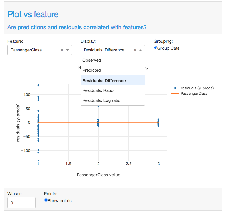
- class explainerdashboard.dashboard_components.regression_components.RegressionVsColComponent(explainer, title='Plot vs feature', name=None, subtitle='Are predictions and residuals correlated with features?', hide_title=False, hide_subtitle=False, hide_footer=False, hide_col=False, hide_ratio=False, hide_points=False, hide_winsor=False, hide_cats_topx=False, hide_cats_sort=False, hide_popout=False, col=None, display='difference', round=3, points=True, winsor=0, cats_topx=10, cats_sort='freq', plot_sample=None, description=None, **kwargs)
Show residuals, observed or preds vs a particular Feature component
- Parameters
explainer (Explainer) – explainer object constructed with either ClassifierExplainer() or RegressionExplainer()
title (str, optional) – Title of tab or page. Defaults to “Plot vs feature”.
name (str, optional) – unique name to add to Component elements. If None then random uuid is generated to make sure it’s unique. Defaults to None.
subtitle (str) – subtitle
hide_title (bool, optional) –
hide_subtitle (bool, optional) – Hide subtitle. Defaults to False.
hide_footer (bool, optional) – hide the footer at the bottom of the component
hide_col (bool, optional) – Hide de column selector. Defaults to False.
hide_ratio (bool, optional) – Hide the toggle. Defaults to False.
hide_points (bool, optional) – Hide group points toggle. Defaults to False.
hide_winsor (bool, optional) – Hide winsor input. Defaults to False.
hide_cats_topx (bool, optional) – hide the categories topx input. Defaults to False.
hide_cats_sort (bool, optional) – hide the categories sort selector.Defaults to False.
hide_popout (bool, optional) – hide popout button. Defaults to False.
col ([type], optional) – Initial feature to display. Defaults to None.
display (str, {'observed', 'predicted', difference', 'ratio', 'log-ratio'} optional) – What to display on y axis. Defaults to ‘difference’.
round (int, optional) – rounding to apply to float predictions. Defaults to 3.
points (bool, optional) – display point cloud next to violin plot for categorical cols. Defaults to True
winsor (int, 0-50, optional) – percentage of outliers to winsor out of the y-axis. Defaults to 0.
cats_topx (int, optional) – maximum number of categories to display for categorical features. Defaults to 10.
cats_sort (str, optional) – how to sort categories: ‘alphabet’, ‘freq’ or ‘shap’. Defaults to ‘freq’.
plot_sample (int, optional) – Instead of all points only plot a random sample of points. Defaults to None (=all points)
description (str, optional) – Tooltip to display when hover over component title. When None default text is shown.
- layout()
layout to be defined by the particular ExplainerComponent instance. All element id’s should append +self.name to make sure they are unique.
- to_html(state_dict=None, add_header=True)
return static html for this component and all subcomponents.
- Parameters
state_dict (dict) – dictionary with id_prop_tuple as keys and state as value.
- component_callbacks(app)
register callbacks specific to this ExplainerComponent.
RegressionModelSummaryComponent
- class explainerdashboard.dashboard_components.regression_components.RegressionModelSummaryComponent(explainer, title='Model Summary', name=None, subtitle='Quantitative metrics for model performance', hide_title=False, hide_subtitle=False, round=3, show_metrics=None, description=None, **kwargs)
Show model summary statistics (RMSE, MAE, R2) component
- Parameters
explainer (Explainer) – explainer object constructed with either ClassifierExplainer() or RegressionExplainer()
title (str, optional) – Title of tab or page. Defaults to “Model Summary”.
name (str, optional) – unique name to add to Component elements. If None then random uuid is generated to make sure it’s unique. Defaults to None.
subtitle (str) – subtitle
hide_title (bool, optional) – hide title
hide_subtitle (bool, optional) – Hide subtitle. Defaults to False.
round (int) – rounding to perform to metric floats.
show_metrics (List) – list of metrics to display in order. Defaults to None, displaying all metrics.
description (str, optional) – Tooltip to display when hover over component title. When None default text is shown.
- layout()
layout to be defined by the particular ExplainerComponent instance. All element id’s should append +self.name to make sure they are unique.
- to_html(state_dict=None, add_header=True)
return static html for this component and all subcomponents.
- Parameters
state_dict (dict) – dictionary with id_prop_tuple as keys and state as value.
decisiontree_components
DecisionTreesComponent
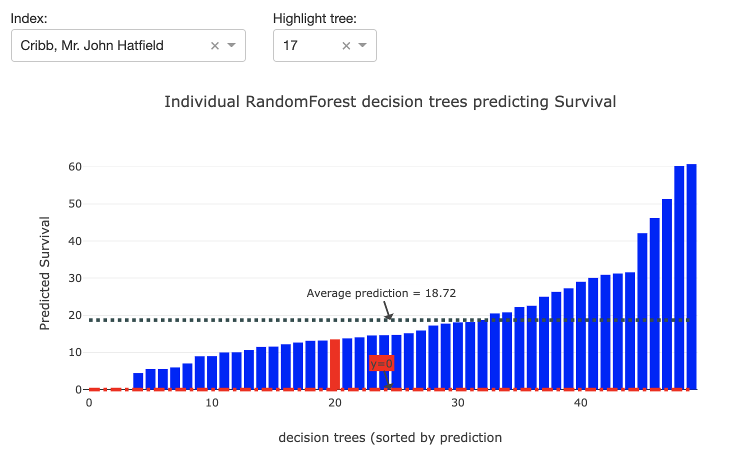
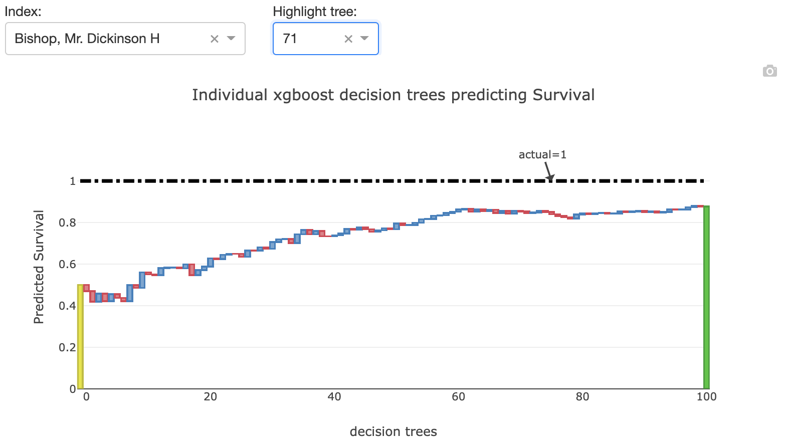
- class explainerdashboard.dashboard_components.decisiontree_components.DecisionTreesComponent(explainer, title='Decision Trees', name=None, subtitle='Displaying individual decision trees', hide_title=False, hide_subtitle=False, hide_index=False, hide_highlight=False, hide_selector=False, hide_popout=False, index_dropdown=True, pos_label=None, index=None, highlight=None, higher_is_better=True, description=None, **kwargs)
Show prediction from individual decision trees inside RandomForest component
- Parameters
explainer (Explainer) – explainer object constructed with either ClassifierExplainer() or RegressionExplainer()
title (str, optional) – Title of tab or page. Defaults to “Decision Trees”.
name (str, optional) – unique name to add to Component elements. If None then random uuid is generated to make sure it’s unique. Defaults to None.
subtitle (str) – subtitle
hide_title (bool, optional) – hide title, Defaults to False.
hide_subtitle (bool, optional) – Hide subtitle. Defaults to False.
hide_index (bool, optional) – Hide index selector. Defaults to False.
hide_highlight (bool, optional) – Hide tree highlight selector. Defaults to False.
hide_selector (bool, optional) – hide pos label selectors. Defaults to False.
hide_popout (bool, optional) – hide popout button
index_dropdown (bool, optional) – Use dropdown for index input instead of free text input. Defaults to True.
pos_label ({int, str}, optional) – initial pos label. Defaults to explainer.pos_label
index ({str, int}, optional) – Initial index to display. Defaults to None.
highlight (int, optional) – Initial tree to highlight. Defaults to None.
higher_is_better (bool, optional) – up is green, down is red. If False flip the colors. (for gbm models only)
description (str, optional) – Tooltip to display when hover over component title. When None default text is shown.
- layout()
layout to be defined by the particular ExplainerComponent instance. All element id’s should append +self.name to make sure they are unique.
- to_html(state_dict=None, add_header=True)
return static html for this component and all subcomponents.
- Parameters
state_dict (dict) – dictionary with id_prop_tuple as keys and state as value.
- component_callbacks(app)
register callbacks specific to this ExplainerComponent.
DecisionPathTableComponent
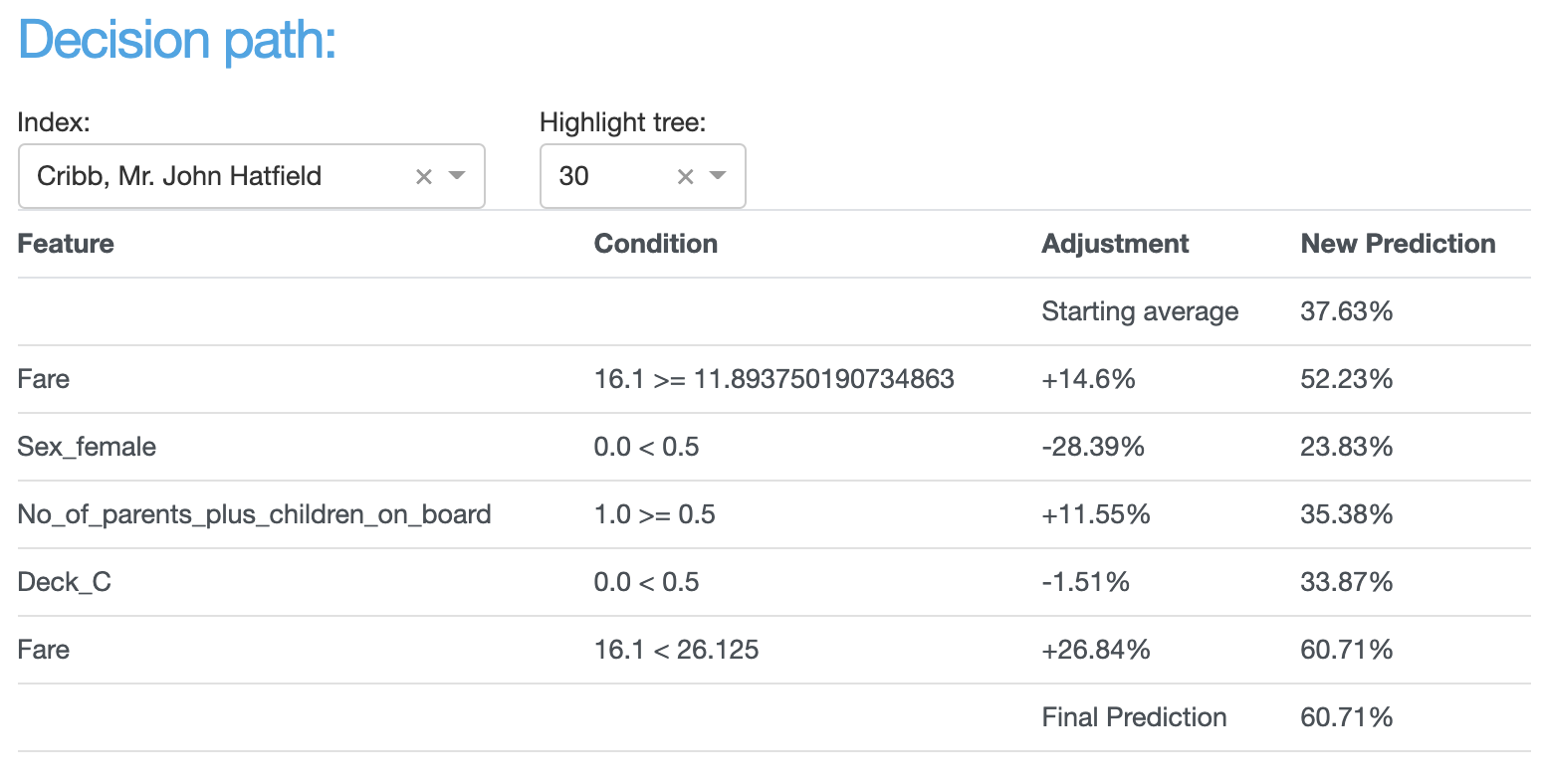
- class explainerdashboard.dashboard_components.decisiontree_components.DecisionPathTableComponent(explainer, title='Decision path table', name=None, subtitle='Decision path through decision tree', hide_title=False, hide_subtitle=False, hide_index=False, hide_highlight=False, hide_selector=False, index_dropdown=True, pos_label=None, index=None, highlight=None, description=None, **kwargs)
Display a table of the decision path through a particular decision tree
- Parameters
explainer (Explainer) – explainer object constructed with either ClassifierExplainer() or RegressionExplainer()
title (str, optional) – Title of tab or page. Defaults to “Decision path table”.
name (str, optional) – unique name to add to Component elements. If None then random uuid is generated to make sure it’s unique. Defaults to None.
subtitle (str) – subtitle
hide_title (bool, optional) – hide title, Defaults to False.
hide_subtitle (bool, optional) – Hide subtitle. Defaults to False.
hide_index (bool, optional) – Hide index selector. Defaults to False.
hide_highlight (bool, optional) – Hide tree index selector. Defaults to False.
hide_selector (bool, optional) – hide pos label selectors. Defaults to False.
index_dropdown (bool, optional) – Use dropdown for index input instead of free text input. Defaults to True.
pos_label ({int, str}, optional) – initial pos label. Defaults to explainer.pos_label
index ({str, int}, optional) – Initial index to display decision path for. Defaults to None.
highlight (int, optional) – Initial tree idx to display decision path for. Defaults to None.
description (str, optional) – Tooltip to display when hover over component title. When None default text is shown.
- layout()
layout to be defined by the particular ExplainerComponent instance. All element id’s should append +self.name to make sure they are unique.
- to_html(state_dict=None, add_header=True)
return static html for this component and all subcomponents.
- Parameters
state_dict (dict) – dictionary with id_prop_tuple as keys and state as value.
- component_callbacks(app)
register callbacks specific to this ExplainerComponent.
DecisionPathGraphComponent
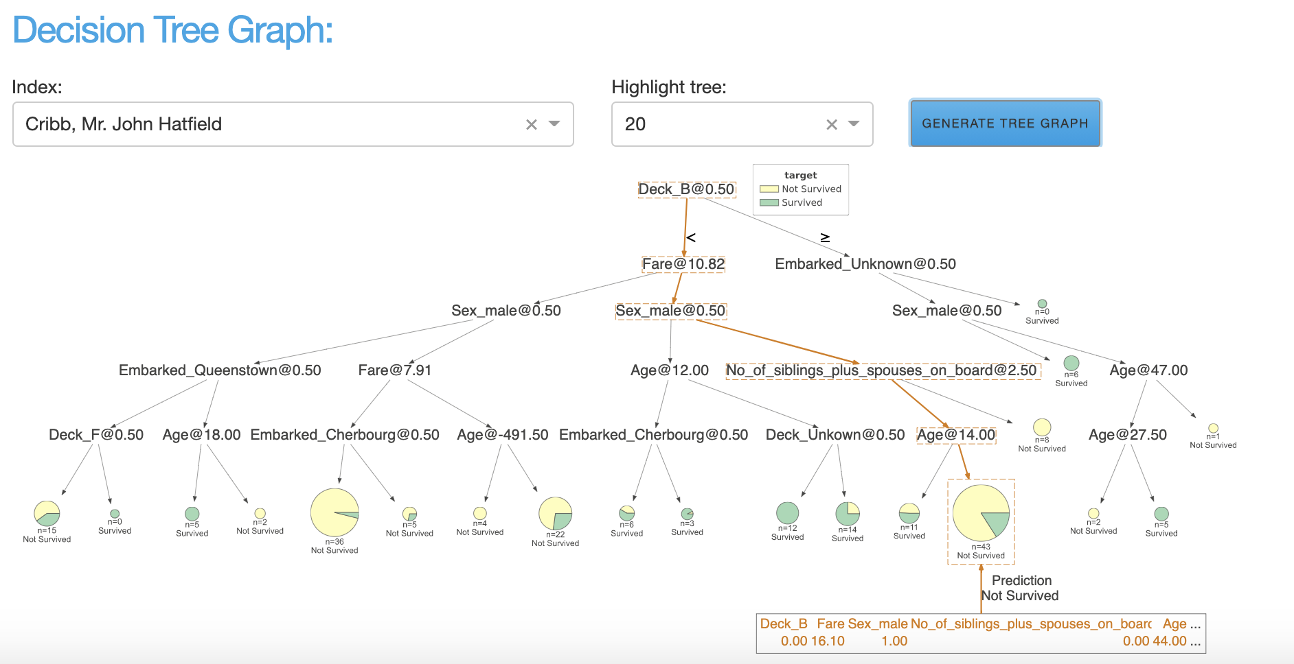
- class explainerdashboard.dashboard_components.decisiontree_components.DecisionPathGraphComponent(explainer, title='Decision path graph', name=None, subtitle='Visualizing entire decision tree', hide_title=False, hide_subtitle=False, hide_index=False, hide_highlight=False, hide_button=False, hide_selector=False, index_dropdown=True, pos_label=None, index=None, highlight=None, description=None, **kwargs)
Display dtreeviz decision path
- Parameters
explainer (Explainer) – explainer object constructed with either ClassifierExplainer() or RegressionExplainer()
title (str, optional) – Title of tab or page. Defaults to “Decision path graph”.
name (str, optional) – unique name to add to Component elements. If None then random uuid is generated to make sure it’s unique. Defaults to None.
subtitle (str) – subtitle
hide_title (bool, optional) – hide title
hide_subtitle (bool, optional) – Hide subtitle. Defaults to False.
hide_index (bool, optional) – hide index selector. Defaults to False.
hide_highlight (bool, optional) – hide tree idx selector. Defaults to False.
hide_button (bool, optional) – hide the button, Defaults to False.
hide_selector (bool, optional) – hide pos label selectors. Defaults to False.
index_dropdown (bool, optional) – Use dropdown for index input instead of free text input. Defaults to True.
pos_label ({int, str}, optional) – initial pos label. Defaults to explainer.pos_label
index ({str, int}, optional) – Initial index to display. Defaults to None.
highlight ([type], optional) – Initial tree idx to display. Defaults to None.
description (str, optional) – Tooltip to display when hover over component title. When None default text is shown.
- layout()
layout to be defined by the particular ExplainerComponent instance. All element id’s should append +self.name to make sure they are unique.
- component_callbacks(app)
register callbacks specific to this ExplainerComponent.
Connectors
CutoffPercentileComponent
- class explainerdashboard.dashboard_components.connectors.CutoffPercentileComponent(explainer, title='Global cutoff', name=None, hide_title=False, hide_cutoff=False, hide_percentile=False, hide_selector=False, pos_label=None, cutoff=0.5, percentile=None, description=None, **kwargs)
Slider to set a cutoff for Classifier components, based on setting the cutoff at a certain percentile of predictions, e.g.: percentile=0.8 means “mark the 20% highest scores as positive”.
This cutoff can then be conencted with other components like e.g. RocAucComponent with a CutoffConnector.
- Parameters
explainer (Explainer) – explainer object constructed with either ClassifierExplainer() or RegressionExplainer()
title (str, optional) – Title of tab or page. Defaults to “Global Cutoff”.
name (str, optional) – unique name to add to Component elements. If None then random uuid is generated to make sure it’s unique. Defaults to None.
hide_title (bool, optional) – Hide title.
hide_cutoff (bool, optional) – Hide the cutoff slider. Defaults to False.
hide_percentile (bool, optional) – Hide percentile slider. Defaults to False.
hide_selector (bool, optional) – hide pos label selectors. Defaults to False.
pos_label ({int, str}, optional) – initial pos label. Defaults to explainer.pos_label
cutoff (float, optional) – Initial cutoff. Defaults to 0.5.
percentile ([type], optional) – Initial percentile. Defaults to None.
description (str, optional) – Tooltip to display when hover over component title. When None default text is shown.
- layout()
layout to be defined by the particular ExplainerComponent instance. All element id’s should append +self.name to make sure they are unique.
- component_callbacks(app)
register callbacks specific to this ExplainerComponent.
PosLabelSelector
- class explainerdashboard.dashboard_methods.PosLabelSelector(explainer, title='Pos Label Selector', name=None, pos_label=None)
For classifier models displays a drop down menu with labels to be selected as the positive class.
Generates a positive label selector with element id ‘pos_label-‘+self.name
- Parameters
explainer (Explainer) – explainer object constructed with e.g. ClassifierExplainer() or RegressionExplainer()
title (str, optional) – Title of tab or page. Defaults to None.
name (str, optional) – unique name to add to Component elements. If None then random uuid is generated to make sure it’s unique. Defaults to ‘Pos Label Selector’.
pos_label (int, optional) – Initial pos label. Defaults to explainer.pos_label.
- layout()
layout to be defined by the particular ExplainerComponent instance. All element id’s should append +self.name to make sure they are unique.
PosLabelConnector
- class explainerdashboard.dashboard_components.connectors.PosLabelConnector(input_pos_label, output_pos_labels)
initialize the ExplainerComponent
- Parameters
explainer (Explainer) – explainer object constructed with e.g. ClassifierExplainer() or RegressionExplainer()
title (str, optional) – Title of tab or page. Defaults to None.
name (str, optional) – unique name to add to Component elements. If None then random uuid is generated to make sure it’s unique. Defaults to None.
- component_callbacks(app)
register callbacks specific to this ExplainerComponent.
CutoffConnector
- class explainerdashboard.dashboard_components.connectors.CutoffConnector(input_cutoff, output_cutoffs)
Connect the cutoff selector of input_cutoff with those of output_cutoffs.
You can use this to connect a CutoffPercentileComponent with a RocAucComponent for example,
When you change the cutoff in input_cutoff, all the cutoffs in output_cutoffs will automatically be updated.
- Parameters
input_cutoff ([{str, ExplainerComponent}]) – Either a str or an ExplainerComponent. If str should be equal to the name of the cutoff property. If ExplainerComponent then should have a .cutoff_name property.
output_cutoffs (list(str, ExplainerComponent)) – list of str of ExplainerComponents.
- component_callbacks(app)
register callbacks specific to this ExplainerComponent.
IndexConnector
- class explainerdashboard.dashboard_components.connectors.IndexConnector(input_index, output_indexes, explainer=None)
Connect the index selector of input_index with those of output_indexes.
You can use this to connect a RandomIndexComponent with a PredictionSummaryComponent for example.
When you change the index in input_index, all the indexes in output_indexes will automatically be updated.
- Parameters
input_index ([{str, ExplainerComponent}]) – Either a str or an ExplainerComponent. If str should be equal to the name of the index property. If ExplainerComponent then should have a .index_name property.
output_indexes (list(str, ExplainerComponent)) – list of str of ExplainerComponents.
- component_callbacks(app)
register callbacks specific to this ExplainerComponent.
HighlightConnector
- class explainerdashboard.dashboard_components.connectors.HighlightConnector(input_highlight, output_highlights)
Connect the highlight selector of input_highlight with those of output_highlights.
You can use this to connect a DecisionTreesComponent component to a DecisionPathGraphComponent for example.
When you change the highlight in input_highlight, all the highlights in output_highlights will automatically be updated.
- Parameters
input_highlight ([{str, ExplainerComponent}]) – Either a str or an ExplainerComponent. If str should be equal to the name of the highlight property. If ExplainerComponent then should have a .highlight_name property.
output_highlights (list(str, ExplainerComponent)) – list of str of ExplainerComponents.
- component_callbacks(app)
register callbacks specific to this ExplainerComponent.