ExplainerTabs
There are seven tabs that make up the default``ExplainerDashboard``:
from explainerdashboard.custom import (ImportancesComposite,
                                       ModelSummaryComposite,
                                       IndividualPredictionsComposite,
                                       WhatIfComposite,
                                       ShapDependenceComposite,
                                       ShapInteractionsComposite,
                                       DecisionTreesComposite)
The definitions can be found in the github repo and can serve as a nice starting point for designing your own custom tabs.
ImportancesComposite
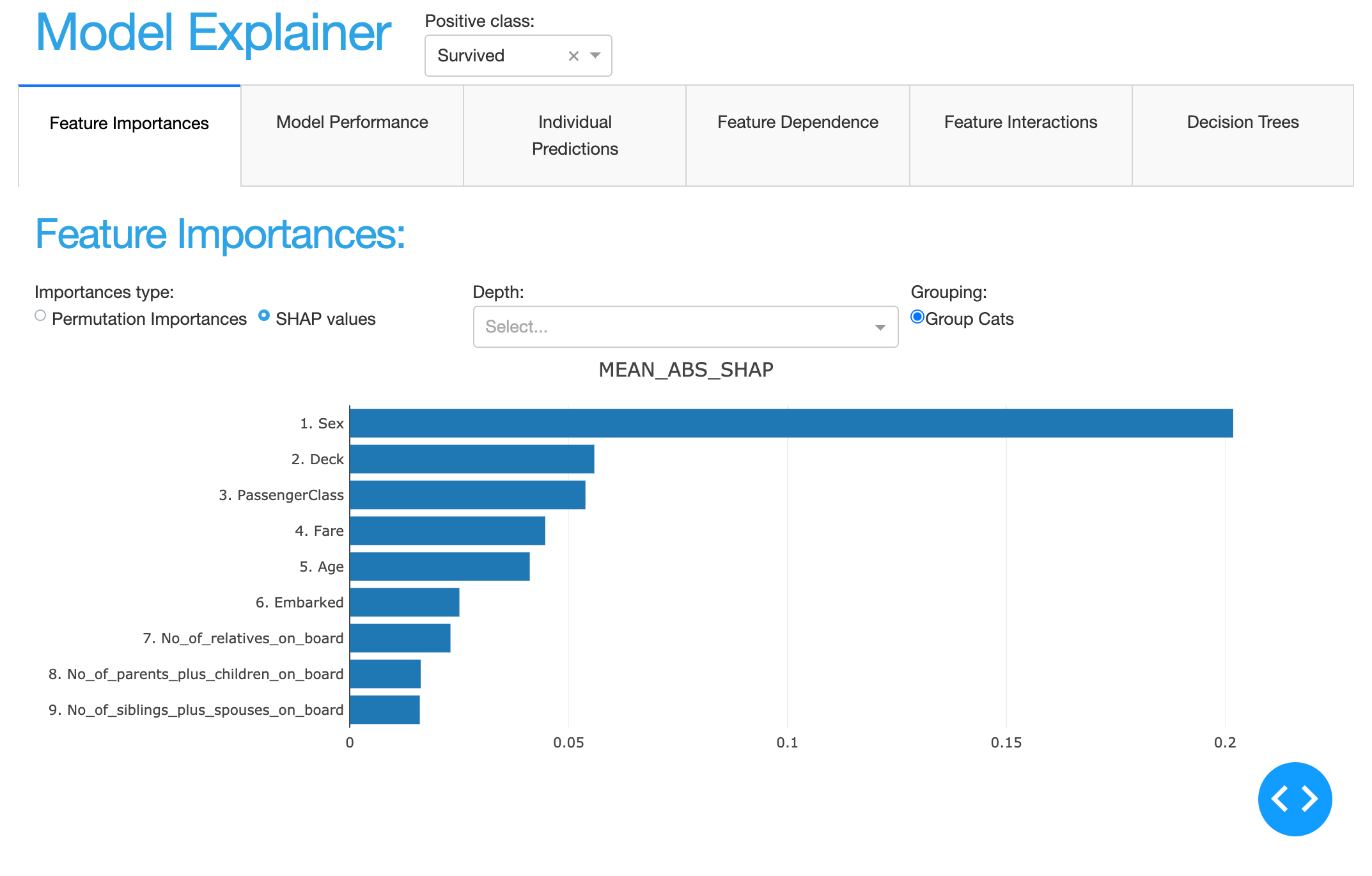
- class explainerdashboard.dashboard_components.composites.ImportancesComposite(explainer, title='Feature Importances', name=None, hide_title=True, hide_importances=False, hide_descriptions=False, hide_selector=True, **kwargs)
Overview tab of feature importances
Can show both permutation importances and mean absolute shap values.
- Parameters
explainer (Explainer) – explainer object constructed with either ClassifierExplainer() or RegressionExplainer()
title (str, optional) – Title of tab or page. Defaults to “Feature Importances”.
name (str, optional) – unique name to add to Component elements. If None then random uuid is generated to make sure it’s unique. Defaults to None.
hide_title (bool, optional) – hide the title
hide_importances (bool, optional) – hide the ImportancesComponent
hide_descriptions (bool, optional) – hide the FeatureDescriptionsComponent
hide_selector (bool, optional) – hide the post label selector. Defaults to True.
- layout()
layout to be defined by the particular ExplainerComponent instance. All element id’s should append +self.name to make sure they are unique.
- to_html(state_dict=None, add_header=True)
return static html for this component and all subcomponents.
- Parameters
state_dict (dict) – dictionary with id_prop_tuple as keys and state as value.
ClassifierModelStatsComposite
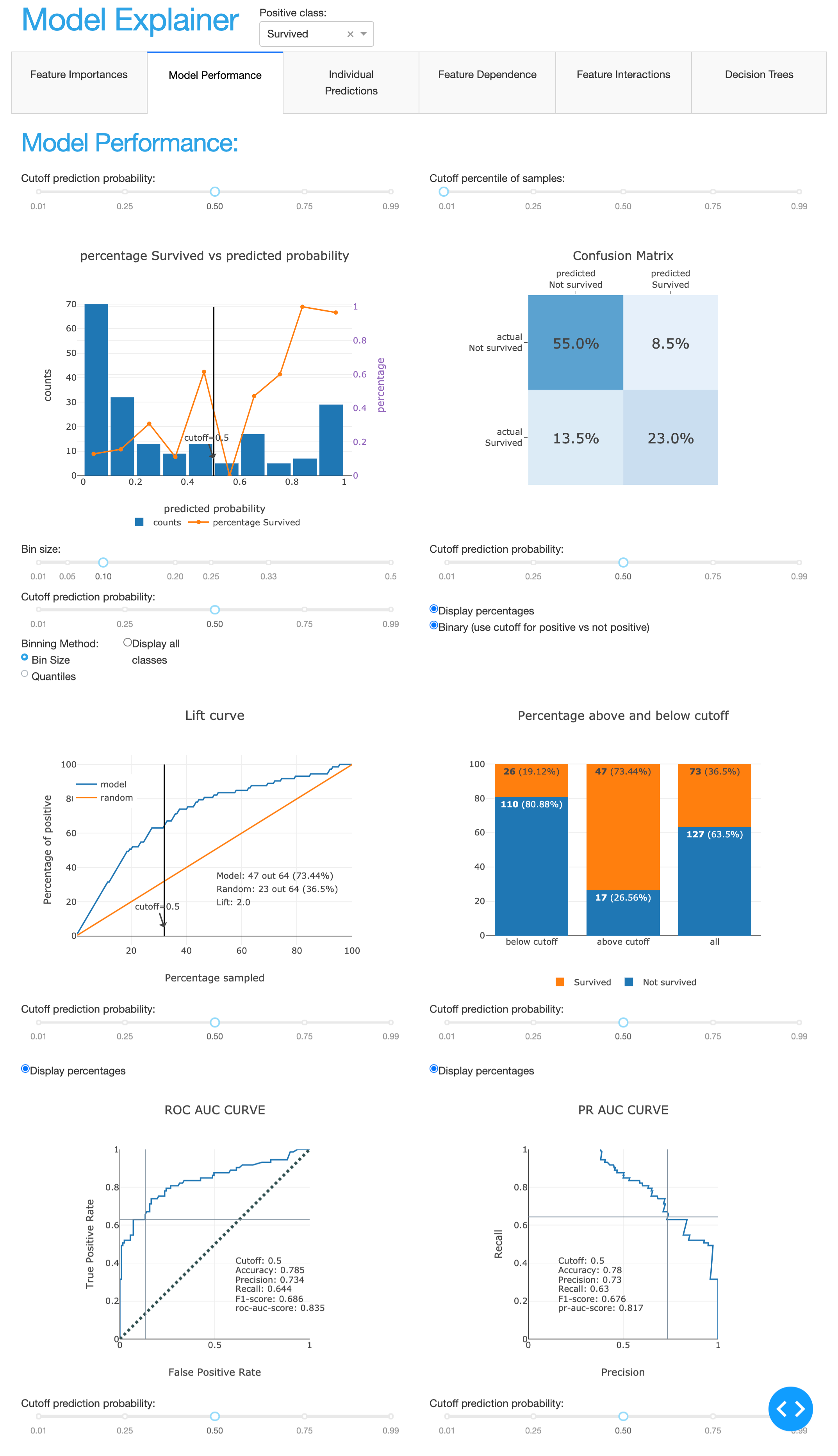
- class explainerdashboard.dashboard_components.composites.ClassifierModelStatsComposite(explainer, title='Classification Stats', name=None, hide_title=True, hide_selector=True, hide_globalcutoff=False, hide_modelsummary=False, hide_confusionmatrix=False, hide_precision=False, hide_classification=False, hide_rocauc=False, hide_prauc=False, hide_liftcurve=False, hide_cumprecision=False, pos_label=None, bin_size=0.1, quantiles=10, cutoff=0.5, **kwargs)
- Composite of multiple classifier related components:
precision graph
confusion matrix
lift curve
classification graph
roc auc graph
pr auc graph
- Parameters
explainer (Explainer) – explainer object constructed with either ClassifierExplainer() or RegressionExplainer()
title (str, optional) – Title of tab or page. Defaults to “Decision Trees”.
name (str, optional) – unique name to add to Component elements. If None then random uuid is generated to make sure it’s unique. Defaults to None.
hide_title (bool, optional) – hide title. Defaults to True.
hide_selector (bool, optional) – hide all pos label selectors. Defaults to True.
hide_globalcutoff (bool, optional) – hide CutoffPercentileComponent
hide_modelsummary (bool, optional) – hide ClassifierModelSummaryComponent
hide_confusionmatrix (bool, optional) – hide ConfusionMatrixComponent
hide_precision (bool, optional) – hide PrecisionComponent
hide_classification (bool, optional) – hide ClassificationComponent
hide_rocauc (bool, optional) – hide RocAucComponent
hide_prauc (bool, optional) – hide PrAucComponent
hide_liftcurve (bool, optional) – hide LiftCurveComponent
hide_cumprecision (bool, optional) – hide CumulativePrecisionComponent
pos_label ({int, str}, optional) – initial pos label. Defaults to explainer.pos_label
bin_size (float, optional) – bin_size for precision plot. Defaults to 0.1.
quantiles (int, optional) – number of quantiles for precision plot. Defaults to 10.
cutoff (float, optional) – initial cutoff. Defaults to 0.5.
- layout()
layout to be defined by the particular ExplainerComponent instance. All element id’s should append +self.name to make sure they are unique.
- to_html(state_dict=None, add_header=True)
return static html for this component and all subcomponents.
- Parameters
state_dict (dict) – dictionary with id_prop_tuple as keys and state as value.
RegressionModelStatsComposite
- class explainerdashboard.dashboard_components.composites.RegressionModelStatsComposite(explainer, title='Regression Stats', name=None, hide_title=True, hide_modelsummary=False, hide_predsvsactual=False, hide_residuals=False, hide_regvscol=False, logs=False, pred_or_actual='vs_pred', residuals='difference', col=None, **kwargs)
Composite for displaying multiple regression related graphs:
predictions vs actual plot
residual plot
residuals vs feature
- Parameters
explainer (Explainer) – explainer object constructed with either ClassifierExplainer() or RegressionExplainer()
title (str, optional) – Title of tab or page. Defaults to “Regression Stats”.
name (str, optional) – unique name to add to Component elements. If None then random uuid is generated to make sure it’s unique. Defaults to None.
hide_title (bool, optional) – hide title. Defaults to True.
hide_modelsummary (bool, optional) – hide RegressionModelSummaryComponent
hide_predsvsactual (bool, optional) – hide PredictedVsActualComponent
hide_residuals (bool, optional) – hide ResidualsComponent
hide_regvscol (bool, optional) – hide RegressionVsColComponent
logs (bool, optional) – Use log axis. Defaults to False.
pred_or_actual (str, optional) – plot residuals vs predictions or vs y (actual). Defaults to “vs_pred”.
residuals (str, {'difference', 'ratio', 'log-ratio'} optional) – How to calcualte residuals. Defaults to ‘difference’.
col ({str, int}, optional) – Feature to use for residuals plot. Defaults to None.
- layout()
layout to be defined by the particular ExplainerComponent instance. All element id’s should append +self.name to make sure they are unique.
- to_html(state_dict=None, add_header=True)
return static html for this component and all subcomponents.
- Parameters
state_dict (dict) – dictionary with id_prop_tuple as keys and state as value.
IndividualPredictionsComposite
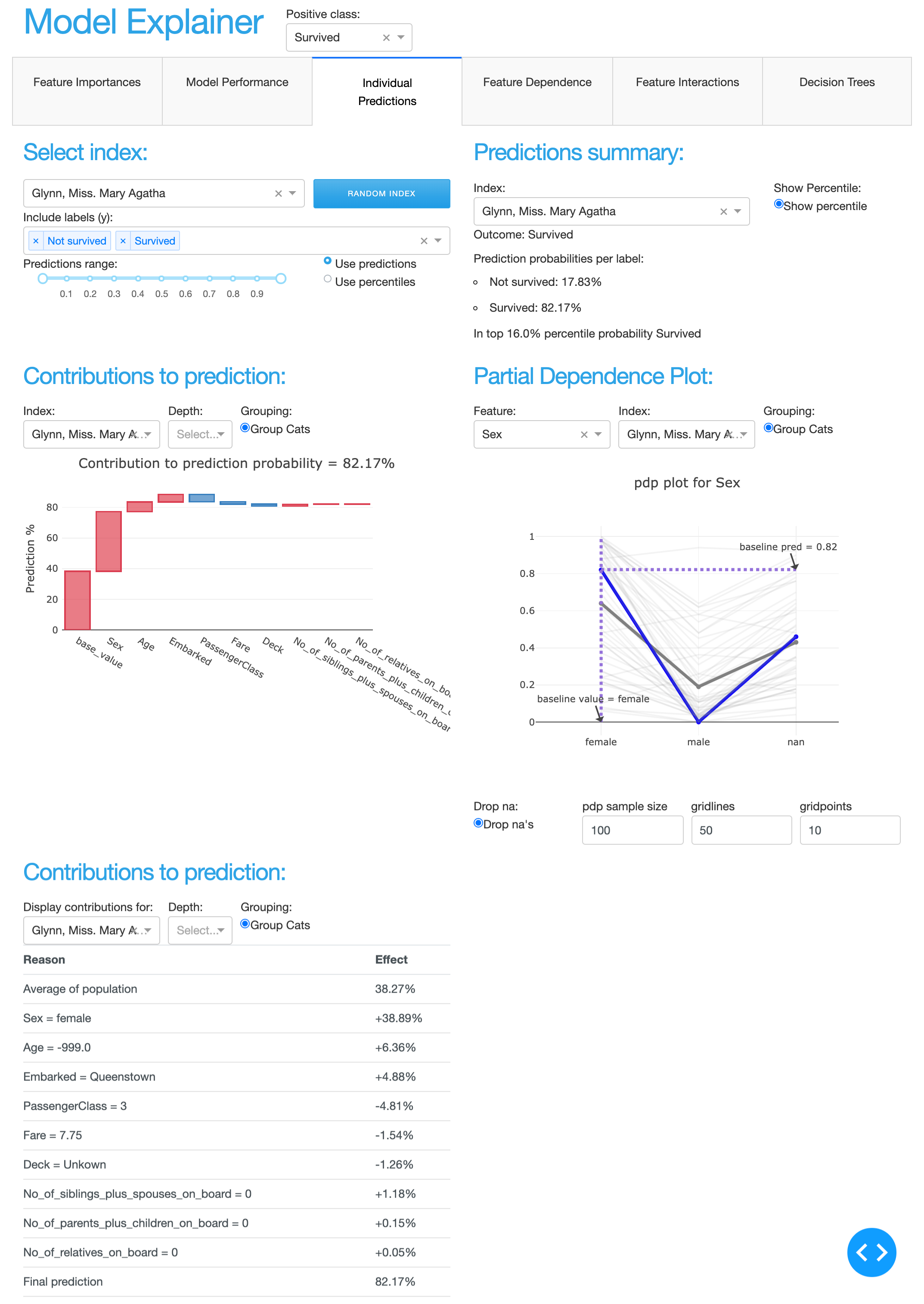
- class explainerdashboard.dashboard_components.composites.IndividualPredictionsComposite(explainer, title='Individual Predictions', name=None, hide_predindexselector=False, hide_predictionsummary=False, hide_contributiongraph=False, hide_pdp=False, hide_contributiontable=False, hide_title=False, hide_selector=True, index_check=True, **kwargs)
Composite for a number of component that deal with individual predictions:
random index selector
prediction summary
shap contributions graph
shap contribution table
pdp graph
- Parameters
explainer (Explainer) – explainer object constructed with either ClassifierExplainer() or RegressionExplainer()
title (str, optional) – Title of tab or page. Defaults to “Individual Predictions”.
name (str, optional) – unique name to add to Component elements. If None then random uuid is generated to make sure it’s unique. Defaults to None.
hide_predindexselector (bool, optional) – hide ClassifierRandomIndexComponent or RegressionRandomIndexComponent
hide_predictionsummary (bool, optional) – hide ClassifierPredictionSummaryComponent or RegressionPredictionSummaryComponent
hide_contributiongraph (bool, optional) – hide ShapContributionsGraphComponent
hide_pdp (bool, optional) – hide PdpComponent
hide_contributiontable (bool, optional) – hide ShapContributionsTableComponent
hide_title (bool, optional) – hide title. Defaults to False.
index_check (bool, optional) – only pass valid indexes from random index selector to feature input. Defaults to True.
hide_selector (bool, optional) – hide all pos label selectors. Defaults to True.
- layout()
layout to be defined by the particular ExplainerComponent instance. All element id’s should append +self.name to make sure they are unique.
- to_html(state_dict=None, add_header=True)
return static html for this component and all subcomponents.
- Parameters
state_dict (dict) – dictionary with id_prop_tuple as keys and state as value.
WhatIfComposite
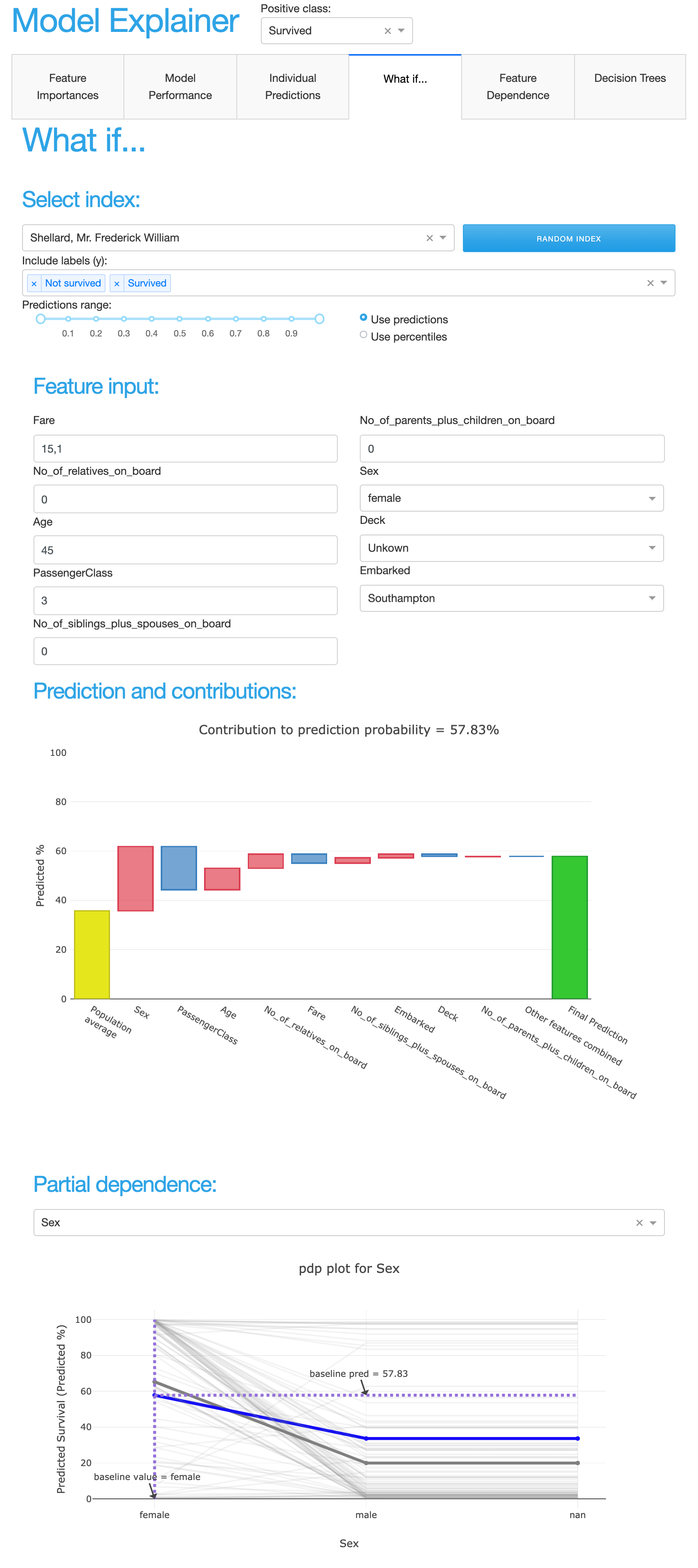
- class explainerdashboard.dashboard_components.composites.WhatIfComposite(explainer, title='What if...', name=None, hide_whatifindexselector=False, hide_inputeditor=False, hide_whatifprediction=False, hide_whatifcontributiongraph=False, hide_whatifpdp=False, hide_whatifcontributiontable=False, hide_title=True, hide_selector=True, index_check=True, n_input_cols=4, sort='importance', **kwargs)
Composite for the whatif component:
- Parameters
explainer (Explainer) – explainer object constructed with either ClassifierExplainer() or RegressionExplainer()
title (str, optional) – Title of tab or page. Defaults to “Individual Predictions”.
name (str, optional) – unique name to add to Component elements. If None then random uuid is generated to make sure it’s unique. Defaults to None.
hide_title (bool, optional) – hide title. Defaults to True.
hide_selector (bool, optional) – hide all pos label selectors. Defaults to True.
hide_whatifindexselector (bool, optional) – hide ClassifierRandomIndexComponent or RegressionRandomIndexComponent
hide_inputeditor (bool, optional) – hide FeatureInputComponent
hide_whatifprediction (bool, optional) – hide PredictionSummaryComponent
hide_whatifcontributiongraph (bool, optional) – hide ShapContributionsGraphComponent
hide_whatifcontributiontable (bool, optional) – hide ShapContributionsTableComponent
hide_whatifpdp (bool, optional) – hide PdpComponent
index_check (bool, optional) – only pass valid indexes from random index selector to feature input. Defaults to True.
n_input_cols (int, optional) – number of columns to divide the feature inputs into. Defaults to 4.
sort ({'abs', 'high-to-low', 'low-to-high', 'importance'}, optional) – sorting of shap values. Defaults to ‘importance’.
- layout()
layout to be defined by the particular ExplainerComponent instance. All element id’s should append +self.name to make sure they are unique.
- to_html(state_dict=None, add_header=True)
return static html for this component and all subcomponents.
- Parameters
state_dict (dict) – dictionary with id_prop_tuple as keys and state as value.
ShapDependenceComposite
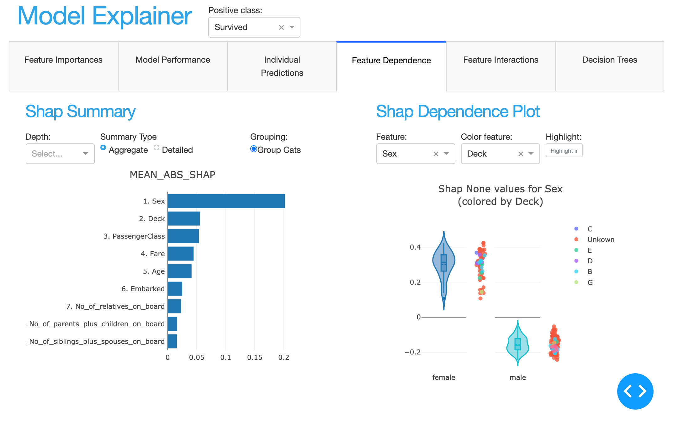
- class explainerdashboard.dashboard_components.composites.ShapDependenceComposite(explainer, title='Feature Dependence', name=None, hide_selector=True, hide_shapsummary=False, hide_shapdependence=False, depth=None, **kwargs)
Composite of ShapSummary and ShapDependence component
- Parameters
explainer (Explainer) – explainer object constructed with either ClassifierExplainer() or RegressionExplainer()
title (str, optional) – Title of tab or page. Defaults to “Feature Dependence”.
name (str, optional) – unique name to add to Component elements. If None then random uuid is generated to make sure it’s unique. Defaults to None.
hide_selector (bool, optional) – hide all pos label selectors. Defaults to True.
hide_shapsummary (bool, optional) – hide ShapSummaryComponent
hide_shapdependence (bool, optional) – ShapDependenceComponent
depth (int, optional) – Number of features to display. Defaults to None.
- layout()
layout to be defined by the particular ExplainerComponent instance. All element id’s should append +self.name to make sure they are unique.
- to_html(state_dict=None, add_header=True)
return static html for this component and all subcomponents.
- Parameters
state_dict (dict) – dictionary with id_prop_tuple as keys and state as value.
ShapInteractionsComposite
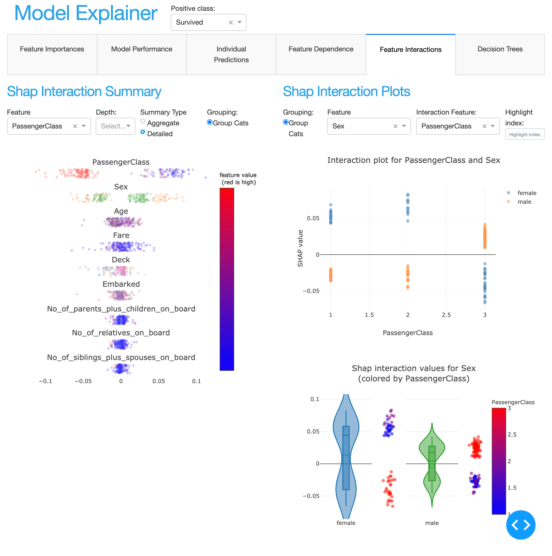
- class explainerdashboard.dashboard_components.composites.ShapInteractionsComposite(explainer, title='Feature Interactions', name=None, hide_selector=True, hide_interactionsummary=False, hide_interactiondependence=False, depth=None, **kwargs)
Composite of InteractionSummaryComponent and InteractionDependenceComponent
- Parameters
explainer (Explainer) – explainer object constructed with either ClassifierExplainer() or RegressionExplainer()
title (str, optional) – Title of tab or page. Defaults to “Feature Interactions”.
name (str, optional) – unique name to add to Component elements. If None then random uuid is generated to make sure it’s unique. Defaults to None.
hide_selector (bool, optional) – hide all pos label selectors. Defaults to True.
hide_interactionsummary (bool, optional) – hide InteractionSummaryComponent
hide_interactiondependence (bool, optional) – hide InteractionDependenceComponent
depth (int, optional) – Initial number of features to display. Defaults to None.
- layout()
layout to be defined by the particular ExplainerComponent instance. All element id’s should append +self.name to make sure they are unique.
- to_html(state_dict=None, add_header=True)
return static html for this component and all subcomponents.
- Parameters
state_dict (dict) – dictionary with id_prop_tuple as keys and state as value.
DecisionTreesComposite
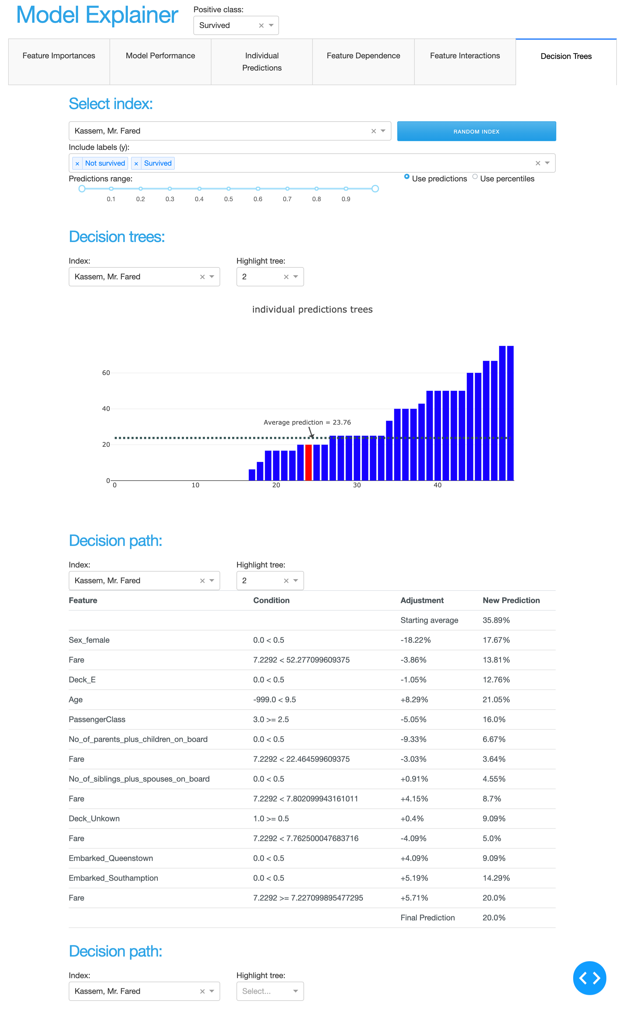
- class explainerdashboard.dashboard_components.composites.DecisionTreesComposite(explainer, title='Decision Trees', name=None, hide_treeindexselector=False, hide_treesgraph=False, hide_treepathtable=False, hide_treepathgraph=False, hide_selector=True, index_check=True, **kwargs)
Composite of decision tree related components:
index selector
individual decision trees barchart
decision path table
deciion path graph
- Parameters
explainer (Explainer) – explainer object constructed with either RandomForestClassifierExplainer() or RandomForestRegressionExplainer()
title (str, optional) – Title of tab or page. Defaults to “Decision Trees”.
name (str, optional) – unique name to add to Component elements. If None then random uuid is generated to make sure it’s unique. Defaults to None.
hide_treeindexselector (bool, optional) – hide ClassifierRandomIndexComponent or RegressionRandomIndexComponent
hide_treesgraph (bool, optional) – hide DecisionTreesComponent
hide_treepathtable (bool, optional) – hide DecisionPathTableComponent
hide_treepathgraph (bool, optional) – DecisionPathGraphComponent
hide_selector (bool, optional) – hide all pos label selectors. Defaults to True.
index_check (bool, optional) – only pass valid indexes from random index selector to feature input. Defaults to True.
- layout()
layout to be defined by the particular ExplainerComponent instance. All element id’s should append +self.name to make sure they are unique.
- to_html(state_dict=None, add_header=True)
return static html for this component and all subcomponents.
- Parameters
state_dict (dict) – dictionary with id_prop_tuple as keys and state as value.
SimplifiedClassifierComposite
screenshot
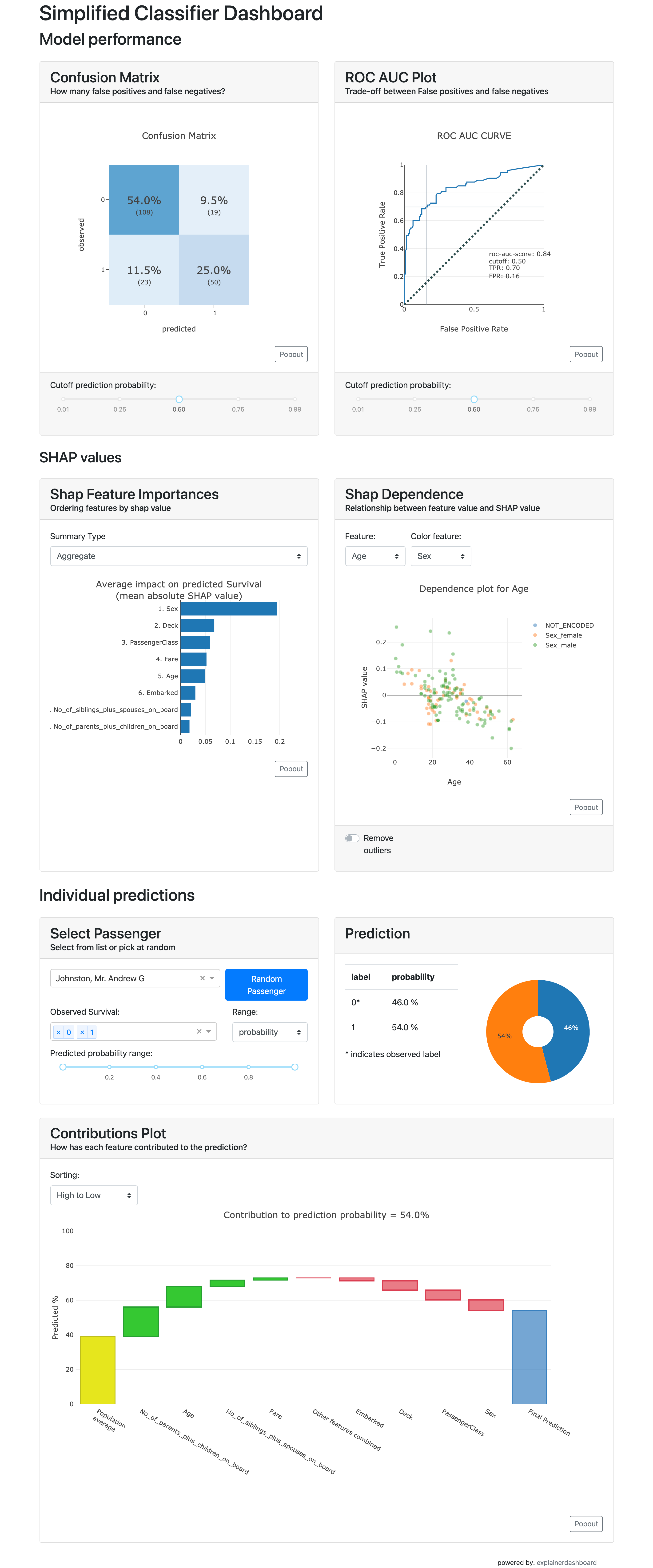
You can also load this composite with:
explainer = ClassifierExplainer(model, X, y)
ExplainerDashboard(explainer, simple=True)
- class explainerdashboard.dashboard_components.composites.SimplifiedClassifierComposite(explainer, title='Simple Classifier Explainer', name=None, hide_title=False, classifier_custom_component='roc_auc', hide_confusionmatrix=False, hide_classifier_custom_component=False, hide_shapsummary=False, hide_shapdependence=False, hide_predindexselector=False, hide_predictionsummary=False, hide_contributiongraph=False, **kwargs)
- Composite of multiple classifier related components, on a single tab:
confusion matrix
- one other model quality indicator: choose from pr auc graph, precision graph,
lift curve, classification graph, or roc auc graph
shap importance
shap dependence
index selector
index prediction summary
index shap contribution graph
- Parameters
explainer (Explainer) – explainer object constructed with either ClassifierExplainer() or RegressionExplainer()
title (str, optional) – Title of tab or page. Defaults to “Simple Classification Stats”.
name (str, optional) – unique name to add to Component elements. If None then random uuid is generated to make sure it’s unique. Defaults to None.
hide_title (bool, optional) – hide the title. Defaults to False.
classifier_custom_component (str, optional) – custom classifier quality indicator supported by the ClassifierExplainer object. Valid values are: ‘roc_auc’, ‘metrics’, pr_auc’, ‘precision_graph’, ‘lift_curve’, ‘classification’. Defaults to ‘roc_auc’.
hide_confusionmatrix (bool, optional) – hide ConfusionMatrixComponent
hide_classifier_custom_component (bool, optional) – hide the chosen classifier_custom_component
hide_shapsummary (bool, optional) – hide ShapSummaryComponent
hide_shapdependence (bool, optional) – hide ShapDependenceComponent
hide_predindexselector (bool, optional) – hide ClassifierRandomIndexComponent or RegressionRandomIndexComponent
hide_predictionsummary (bool, optional) – hide ClassifierPredictionSummaryComponent or RegressionPredictionSummaryComponent
hide_contributiongraph (bool, optional) – hide ShapContributionsGraphComponent
- layout()
layout to be defined by the particular ExplainerComponent instance. All element id’s should append +self.name to make sure they are unique.
- to_html(state_dict=None, add_header=True)
return static html for this component and all subcomponents.
- Parameters
state_dict (dict) – dictionary with id_prop_tuple as keys and state as value.
SimplifiedRegressionComposite
screenshot
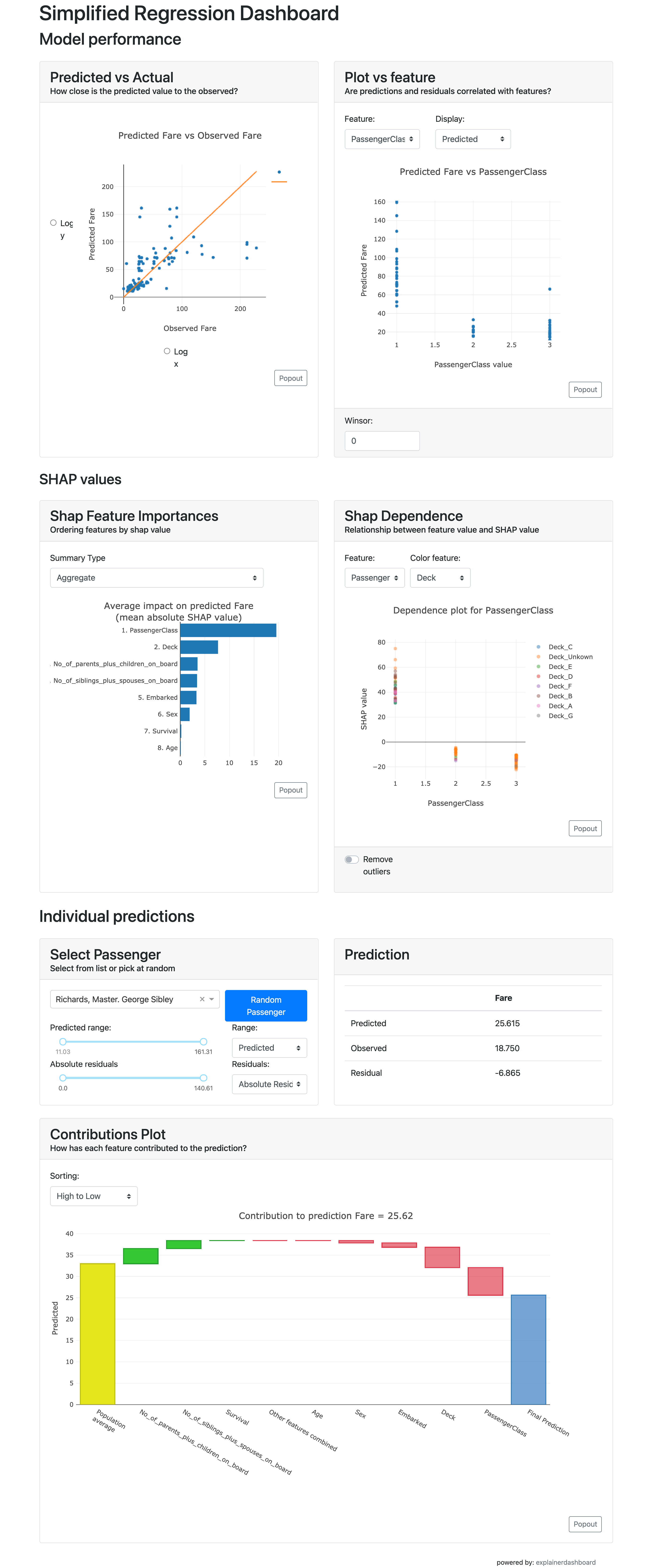
You can also load this composite with:
explainer = RegressionExplainer(model, X, y)
ExplainerDashboard(explainer, simple=True)
- class explainerdashboard.dashboard_components.composites.SimplifiedRegressionComposite(explainer, title='Simple Regression Explainer', name=None, hide_title=False, regression_custom_component='vs_col', hide_goodness_of_fit=False, hide_regression_custom_component=False, hide_shapsummary=False, hide_shapdependence=False, hide_predindexselector=False, hide_predictionsummary=False, hide_contributiongraph=False, **kwargs)
- Composite of multiple classifier related components, on a single tab:
goodness of fit component
one other model quality indicator: ‘metrics’, ‘residuals’ or’residuals_vs_col’
shap importance
shap dependence
index selector
index prediction summary
index shap contribution graph
- Parameters
explainer (Explainer) – explainer object constructed with either ClassifierExplainer() or RegressionExplainer()
title (str, optional) – Title of tab or page. Defaults to “Simple Classification Stats”.
name (str, optional) – unique name to add to Component elements. If None then random uuid is generated to make sure it’s unique. Defaults to None.
hide_title (bool, optional) – hide the title. Defaults to False.
regression_custom_component (str, optional) – custom classifier quality indicator supported by the ClassifierExplainer object. Valid values are: ‘metrics’, ‘residuals’ or’vs_col’
hide_goodness_of_fit (bool, optional) – hide goodness of fit component
hide_regression_custom_component (bool, optional) – hide the chosen regression_custom_component
hide_shapsummary (bool, optional) – hide ShapSummaryComponent
hide_shapdependence (bool, optional) – hide ShapDependenceComponent
hide_predindexselector (bool, optional) – hide RegressionRandomIndexComponent or RegressionRandomIndexComponent
hide_predictionsummary (bool, optional) – hide RegressionPredictionSummaryComponent or RegressionPredictionSummaryComponent
hide_contributiongraph (bool, optional) – hide ShapContributionsGraphComponent
- layout()
layout to be defined by the particular ExplainerComponent instance. All element id’s should append +self.name to make sure they are unique.
- to_html(state_dict=None, add_header=True)
return static html for this component and all subcomponents.
- Parameters
state_dict (dict) – dictionary with id_prop_tuple as keys and state as value.
ExplainerTabsLayout
- class explainerdashboard.dashboards.ExplainerTabsLayout(explainer, tabs, title='Model Explainer', name=None, description=None, header_hide_title=False, header_hide_selector=False, header_hide_download=False, hide_poweredby=False, block_selector_callbacks=False, pos_label=None, fluid=True, **kwargs)
Generates a multi tab layout from a a list of ExplainerComponents. If the component is a class definition, it gets instantiated first. If the component is not derived from an ExplainerComponent, then attempt with duck typing to nevertheless instantiate a layout.
- Parameters
explainer ([type]) – explainer
tabs (list[ExplainerComponent class or instance]) – list of ExplainerComponent class definitions or instances.
title (str, optional) – [description]. Defaults to ‘Model Explainer’.
description (str, optional) – description tooltip to add to the title.
header_hide_title (bool, optional) – Hide the title. Defaults to False.
header_hide_selector (bool, optional) – Hide the positive label selector. Defaults to False.
header_hide_download (bool, optional) – Hide the download link. Defaults to False.
hide_poweredby (bool, optional) – hide the powered by footer
block_selector_callbacks (bool, optional) – block the callback of the pos label selector. Useful to avoid clashes when you have your own PosLabelSelector in your layout. Defaults to False.
pos_label ({int, str}, optional) – initial pos label. Defaults to explainer.pos_label
fluid (bool, optional) – Stretch layout to fill space. Defaults to False.
- layout()
returns a multitab layout plus ExplainerHeader
- to_html(state_dict=None, add_header=True)
return static html for this component and all subcomponents.
- Parameters
state_dict (dict) – dictionary with id_prop_tuple as keys and state as value.
- register_callbacks(app)
Registers callbacks for all tabs
- calculate_dependencies()
Calculates dependencies for all tabs
ExplainerPageLayout
- class explainerdashboard.dashboards.ExplainerPageLayout(explainer, component, title='Model Explainer', name=None, description=None, header_hide_title=False, header_hide_selector=False, header_hide_download=False, hide_poweredby=False, block_selector_callbacks=False, pos_label=None, fluid=False, **kwargs)
Generates a single page layout from a single ExplainerComponent. If the component is a class definition, it gets instantiated.
If the component is not derived from an ExplainerComponent, then tries with duck typing to nevertheless instantiate a layout.
- Parameters
explainer ([type]) – explainer
component (ExplainerComponent class or instance) – ExplainerComponent class definition or instance.
title (str, optional) – Defaults to ‘Model Explainer’.
description (str, optional) – Will be displayed as title tooltip.
header_hide_title (bool, optional) – Hide the title. Defaults to False.
header_hide_selector (bool, optional) – Hide the positive label selector. Defaults to False.
header_hide_download (bool, optional) – Hide the download link. Defaults to False.
hide_poweredby (bool, optional) – hide the powered by footer
block_selector_callbacks (bool, optional) – block the callback of the pos label selector. Useful to avoid clashes when you have your own PosLabelSelector in your layout. Defaults to False.
pos_label ({int, str}, optional) – initial pos label. Defaults to explainer.pos_label
fluid (bool, optional) – Stretch layout to fill space. Defaults to False.
- layout()
returns single page layout with an ExplainerHeader
- to_html(state_dict=None, add_header=True)
return static html for this component and all subcomponents.
- Parameters
state_dict (dict) – dictionary with id_prop_tuple as keys and state as value.
- register_callbacks(app)
Register callbacks of page
- calculate_dependencies()
Calculate dependencies of page